One thing in common with all consumers is their desire for a quick, easy, and informed path to purchase.
This is true whether waiting in line at a brick-and-mortar or buying online. I’m sure you can agree.
In fact, the last time I had a hard time finding a product, putting something in the cart and checking out, it was all over. I abandoned the experience because there’s no time for that—especially on mobile!
A great ecommerce user experience design gets shoppers through the process effectively.
It will improve your traffic, increase conversions and build trust in your brand.
While not all brands have the ability to offer a convenient app with one-click buying (like Amazon), there are basic ecommerce best practices necessary for a great user experience when buying something online.
Focus on these fundamental areas, to help ensure a successful online shopping experience.
1. Mobile Experience with Responsive Web Design
A responsive web design allows customers to have a consistent ecommerce website experience across any device they choose to use while shopping–whether desktop, tablet or mobile.
Consumers likely will not stop buying things with their computer or laptop. However, studies are showing that 54% of online ecommerce traffic comes from a mobile smartphone.
While 30% of this traffic actually brings in revenue, rapid advancements in technology will only support growth for mobile ecommerce conversions.
If your ecommerce site still does not have a mobile-friendly experience, you need to think about adding one as soon as possible.
Not only will it create a seamless experience across devices, but it helps with search engine optimization efforts. In fact, Google definitively announced that mobile-friendly web sites will rank better in mobile search).
SEE ALSO: Why Responsive Design is Important and Google Approved
[clickToTweet tweet=”Over 54% of online #ecommerce traffic comes from a mobile smartphone. #UX” quote=”Over 54% of online ecommerce traffic comes from a mobile smartphone.”]

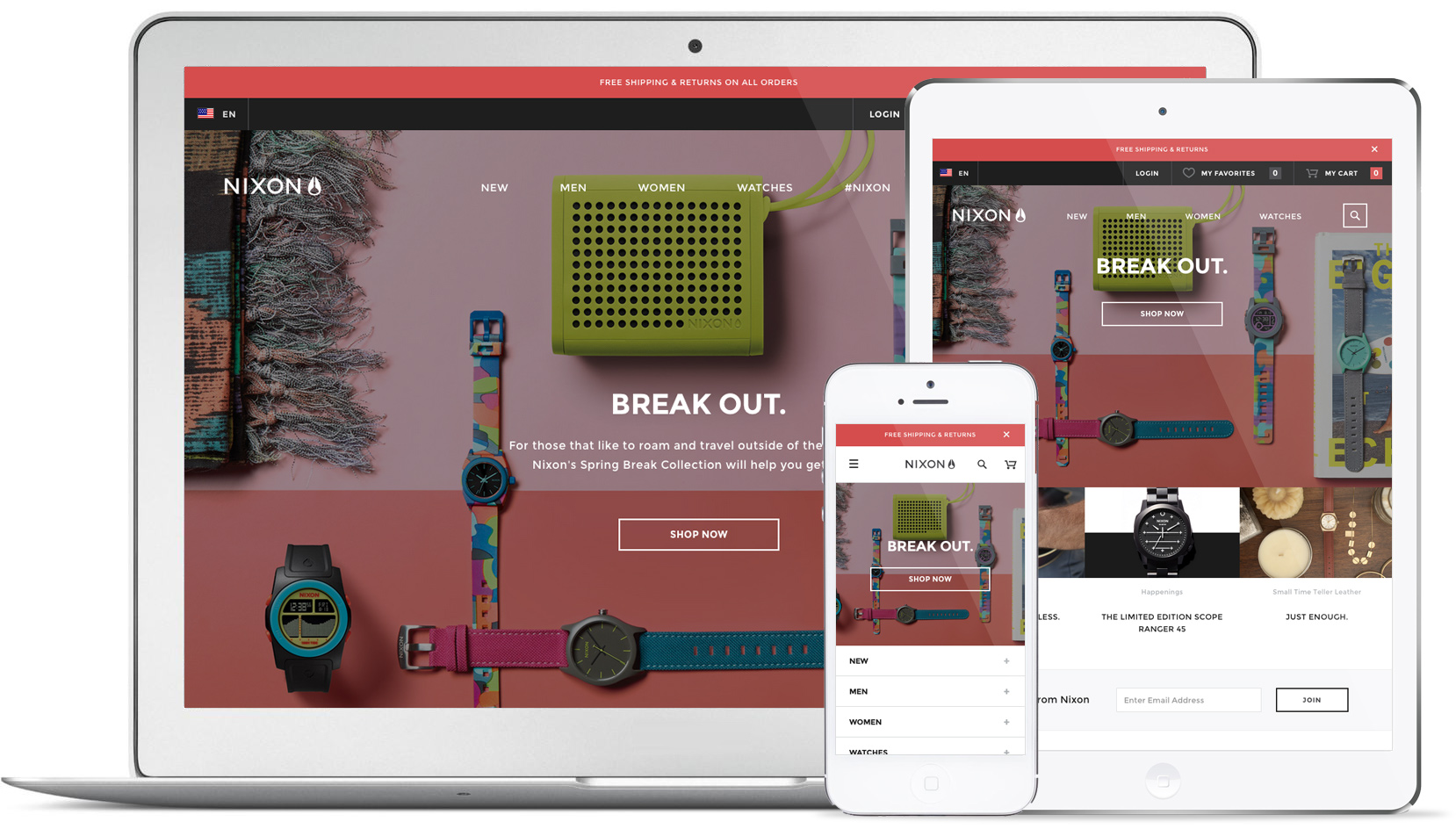
The Nixon site does a great job combining brand and culture, using ecommerce user experience best practices. The responsive web design experience carries through from large screens to small.
2. Flat Design = Clean & Focused Design
In the world of web design trends, flat design has still been reigning supreme within user interfaces for the past few years.
Apple, Microsoft and Google (read about Google’s design ideas here) have all minimized the look and feel of their OS in an effort to present a simple, honest and essential experience.
Aside from usage by technology giants, there is also merit to the flat design style for any web design.
Basically, this means removing decoration (farewell to bevels, glows, shadows and textures!), to allow for a clean and focused ecommerce user experience design.
Clean design gives a page the breathing room it needs to offer a compelling call to action for engagement.
Focused design can help showcase products—such as large and detailed imagery that a customer needs to make their decision to buy now.
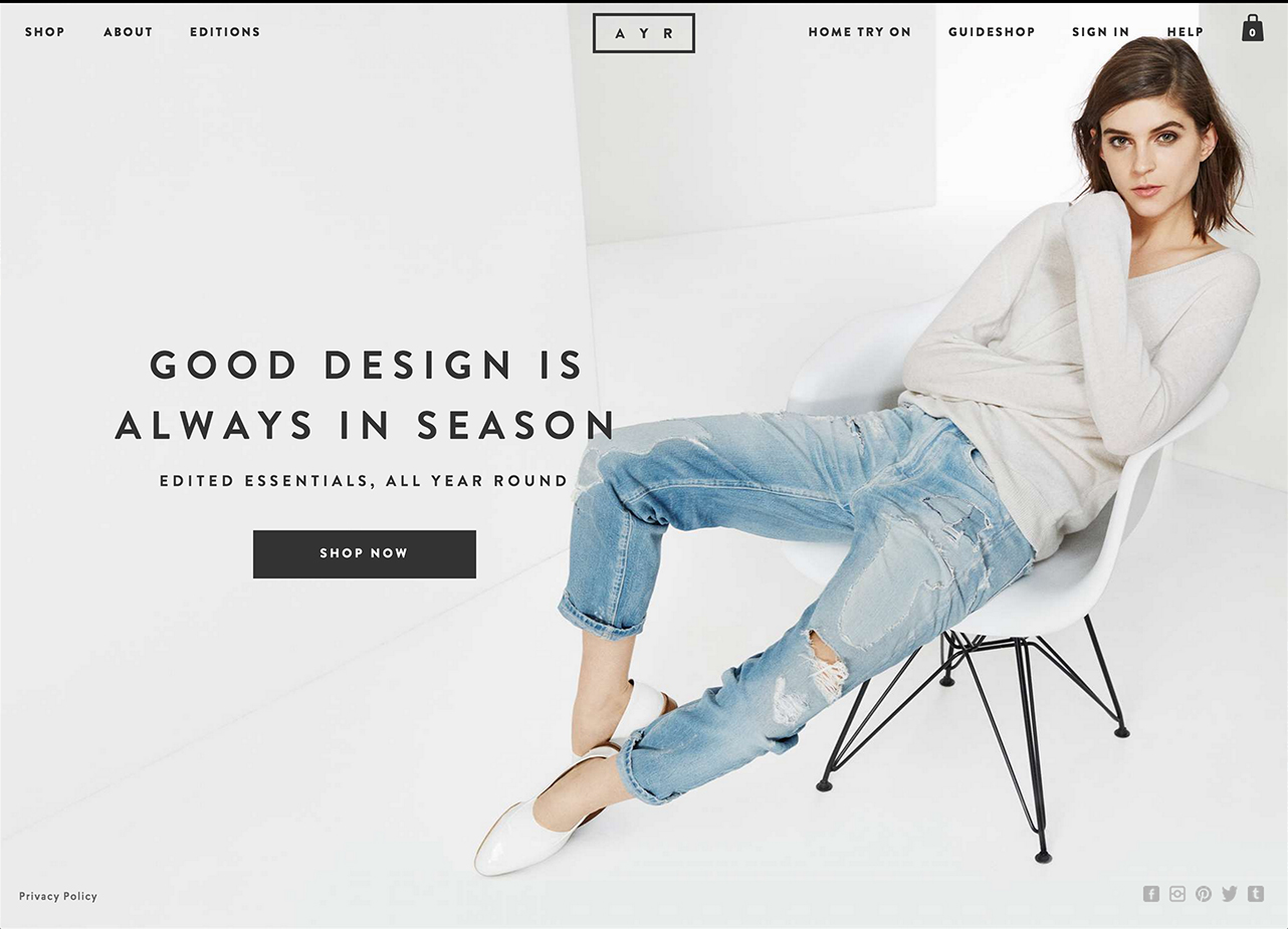
Ayr has a clean, minimal flat design. This use of ecommerce user experience best practices also uses color sparingly. Beautiful lifestyle photography tells a story about the products without being interrupted by too much interface design embellishment. Don’t you just want to kick back in those jeans?
[clickToTweet tweet=”Clean design gives a page breathing room it needs for the best CTA for engagement. #ecommerce #UX” quote=”Clean design gives a page the breathing room it needs to offer a compelling call to action for engagement.”]
3. Organized & Easy-to-use Navigation
Navigation is a tool that guides users in the right direction and assists in browsing a product catalog.
Always make the navigation prominent and super organized.
This may seem like a no-brainer, but you’d be surprised how many ecommerce sites did not take the time to really think about this!
Navigation should be easy to find with obvious category and sub-category names. Keep the navigation in the same place using the same style, colors and fonts, on all pages.
Allow users to shop in different ways outside of general categories…for example by brand, or by new arrivals.
When they can’t find it, they won’t buy it…simple as that.
Don’t forget the impact of a search bar! This is a frequently used method that helps shoppers on the best ecommerce websites navigate to find exactly what they are looking for.
As with navigation, put the search bar in an easy-to-find place in the header on all pages. Use the most robust search functionality that your site can afford or accommodate.
Ecommerce website best practices to consider for search:
- Offer auto-complete suggestions
- Allow for search by product name, and model number
- Support symbols & abbreviations within a search term
[clickToTweet tweet=”When they can’t find it on your website, they won’t buy it…simple as that. #ecommerce #UX” quote=”When they can’t find it on your website, they won’t buy it…simple as that.”]
SEE ALSO: 7 Most Common Website Design Mistakes To Avoid in 2020
4. Excellent Product Photography (and Video)
Even though the “store” is online, products should be pristine and well presented—just like inside an actual brick and mortar.
Ecommerce website shoppers are not going to be able to touch the items before they buy.
So the best way to describe what’s for sale is with lots of well-photographed images presented in as large a format as possible (zoom functionality can help with small details).
Here are some tips for the best ecommerce experience visually:
- Show more than one angle of a product
- Display the product in a context
- Reveal interesting product details
Also, include a video if possible. Videos can help a customer understand how a product is used/made, or is an opportunity to promote the item for a particular customer’s lifestyle.
Beautiful photos in an ecommerce website design can convey the value of a product, and be one of the major deciding factors in a conversion. A good photographer can help achieve success well beyond the initial investment.
On a budget? Learn more about taking high-quality photos yourself (it’s not as difficult as you may think!).
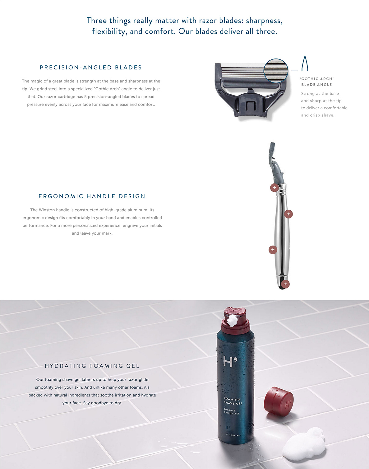
Harry’s does a nice job of telling the story for simple daily use products: razors and shave cream. They display close-up details, include an interactive graphic about the benefits of the design, and show product in context.
5. Product Detail Page Must-Haves
The product detail page is one of the most complex, and important pages in an ecommerce website design. There is a fine line between keeping it clean but informative, and too cluttered.
With so many things to consider, here are some majors:
A highly visible Add to Cart button
The Add to Cart button should be a good size, readable, above the fold if possible, and in a color that stands out from the rest of the page.
This button shouldn’t be overlooked!
Be sure to use the call to action of “Add to Cart”, or “Buy Now”. Creative copy is not needed for this particular CTA. Tell the customer exactly what they should do!
Showcase product imagery (see #4)
Plan for the following with your product images:
- large product photos
- close detail shots
- product video
- 360° views
- variant images
Variant images are showing the same product in its different colors, textures or fabrics.
Users pay close attention to photos and other images that contain relevant information…In ecommerce, product photos help users understand products and differentiate between similar items. – Jakob Nielsen, Photos as Web Content
Use trust badges
Adding visible trust badge graphics to a site is one of the most important ecommerce user experience best practices.
Add them to product detail pages, shopping cart, and checkout.
It will help strengthen the buying confidence of a customer.
In addition to trust badges, get your site working with an SSL certificate so that browsing and buying from the site is even more secure. Added bonus: Google gives secure HTTPS sites a boost in search engine ranking.
Allow customers to read and add reviews
It might seem daunting to give the public access to fully disclose about a product, but 7 out of 10 shoppers consult reviews before making a purchase.
If your product is amazing, then let people review it!
Ratings can help other potential customers understand the value of the product they are buying, and also help you fine-tune your offering with (free) feedback.
Studies show that customer reviews can create a 74% increase in conversion.
[clickToTweet tweet=”7/10 of shoppers consult reviews before making a purchase, resulting in a 74% increase in conversion” quote=”7 out of 10 of shoppers consult reviews before making a purchase, resulting in a 74% increase in conversion.”]
Conclusion
There are, of course, more than five ecommerce user experience best practices to consider. These are the absolute essentials for your online shop!
Use this checklist of great ecommerce design basics, which can only strengthen the online shopping experience.
- Mobile experience with responsive web design
- Flat design = clean and focused design
- Organized and easy-to-use navigation
- Excellent product photography (and Video)
- Product detail page must-haves
The beauty of the web is that enhancements and changes can always be measured through analytics and A/B testing. Remember that not all ecommerce website stores are the same, so use these basics as guidelines but create effective experiences tailored to the targeted customer for your specific brand.
What are some other ecommerce user experience best practices to consider?
Share with us in the comments below!
FreshSparks is a branding agency specializing in brand strategy, brand identity and brand marketing. We can help your customers trust and love your brand so that they convert after enjoying their online shopping experience! Contact us to chat about your next project.


Thank you for the amazing article. I look forward to reading more of your work in the future.
Thankyou for sharing your information with us
CIMON is an AI Astronaut Assistant that is developed by German space agency DLR, Airbus, and IBM. This artificial intelligence robot can help astronauts on the ISS.
https://www.analyticsinsight.net/ai-astronaut-cimon-worlds-first-flying-ai-assistant-into-iss/
Thankyou for sharing your article with us
Pentagon is interested in artificial intelligence solutions for everything from data analysis to surveillance, maintenance, and medical care, but before diving headfirst into an AI future, the Defense Department is laying out certain ethical rules to follow.
For more information visit the website : https://www.globaltechoutlook.com/how-is-the-pentagon-using-ai-to-enhance-security-and-defense-initiatives/
Very Nice article thank you for sharing
Analytics Insight predicts that the revenue for machine learning technologies and solutions will grow exponentially to US$80.3 billion by 2023. Making its presence felt in every sector, especially healthcare, this advanced technology is thriving on high ROI.
for more information visit the website: https://www.analyticsinsight.net/machine-learning-is-expected-to-reach-us80-3-billion-in-revenue-by-2023/
Very Nice Article
According to a recent report by the US intelligence agency, AI, climate change, debt pressure, and digital currency are going to pose threats for the economy in the next two decades. The impacts of climate change will be huge and rapid, says the report
for more information visit the website: https://www.analyticsinsight.net/will-ai-and-digital-currencies-lead-to-an-unstable-world/
Thankyou for the article. it is really useful
2020 taught us the toughest lessons in the form of unemployment. Employment opportunities and jobs were challenging and meek until the fintech firms took over the game.
For further information visit our website: https://industrywired.com/fintech-firms-that-hold-promises-of-employment-for-new-india/
Thankyou For Sharing the information with us
Quantum computing patent applications are steadily increasing and are expected to see a significant rise. Here’s a look at the top companies leading quantum computing application fillings.
For more information visit our website: https://www.analyticsinsight.net/top-companies-leading-quantum-computing-patent-applications/
Thankyou for sharing the information with us
Voice gaming is all set to revamp the gaming industry and the effects are quite amusing. These technologies are becoming more common, and they’re being used to upgrade old games or build innovative unique ones.
for more information visit our website: https://www.globaltechoutlook.com/voice-gaming-is-all-set-to-revamp-the-gaming-industry-yay-or-nay/
Thank you for the article. Really useful and interesting information. I’ll try to show these things to my friend, he was just looking for how to improve his site. He has a specific topic enough, but very useful.Removal and elimination of everything that is possible and people do not need.
We reviewed your blog on your website and we really liked it.We also have some amazing blogs on our website and we would like you to review our website
spectrum-consultancy.com
http://www.emdfurniturecenter.com/shop/ also well to buy,good shop
Hey, thanks for sharing wonderful article. Implementing the best user experience practices will help in selling better too your customers.
Great article! Thanks!
Thanks for your comment, Cortney! Glad you enjoyed it. Hope to hear more from you soon.
Hi writer this article Helped me .., so i m back to right thank say thank you
Hello Peter! Glad that this content helped you. Hope to hear more from you again soon!