
As a growing brand, the last thing you want is to be guilty of web design mistakes when launching an online presence.
A professional website is a requirement for gaining new customers, establishing credibility and fostering client relationships.
Ideally, the most effective websites provide:
- an optimal user-friendly experience,
- a steady flow of targeted leads,
- and of course, ongoing sales!
There’s no better time to take a look at your website brand strategy than right now—in an effort to uncover some of the most common web design mistakes to avoid.
I’ll show you seven major issues that will help you bring in more business with quick and easy fixes.
But first:
Before building a new website (or undergoing a redesign), ask yourself a few fundamental questions:
- What are the goals of the website?
- Who are the target customers or clients?
- How will I drive traffic to the website?
- Who is going to update the website, and how often?
- How much will website maintenance or updates cost?
Already have an existing website? Not to worry: any common web design mistakes can be corrected with some thought and effort.
Outline the basics of your web strategy first (answering the questions above). Then, avoid the following costly errors before launching your website.
MISTAKE #1
1. A Lack of Clear Call to Action
Missing call to action is probably one of the biggest small business website mistakes we see across the board.
The best website user experience should tell a customer the what, where, and how.
- What to do.
- Where to go.
- How to feel.
What is a call to action?
A call to action (or, CTA) will get visitors focused on what their next step is. It is a prompt that is written with a persuasive command attached to a link or button.
Use content that describes the value of your products or services, along with a compelling phrase that prompts action.
Be very clear with your language.
It’s not necessary to get creative with call to action wording.
Keep your call to action simple and succinct. Tell users exactly what to do!
Strong website CTAs include:
- Add to Cart
- Get Started
- Contact Us Today
- Yes, Sign Me Up
- Buy Now

Take cues from the above examples using a call to action on their main button. The three CTAs direct a user towards exactly what they need to do on each particular site: Sign up, Subscribe, or Get Started. Clockwise: Uber, Square, Birchbox.
[click_to_tweet tweet=”Keep your call to action simple and succinct. Tell users exactly what to do! #smallbiz #marketing” quote=”Keep your call to action simple and succinct. Tell users exactly what to do!”]
MISTAKE #2
2. No Analytics to Measure Performance
One of the biggest web design mistakes to avoid is not looking at important data behind a website’s use.
Get this: 75% of small business sites do not use analytics tools to track performance!
Think of your website as an investment.
One of the most important things you can do to protect this investment is to analyze progress and measure success.
It’s a simple concept, right?
A huge benefit of online marketing is the ability to easily test, track, and adjust.
SEE ALSO: 19 Digital Marketing Metrics For Measuring Success
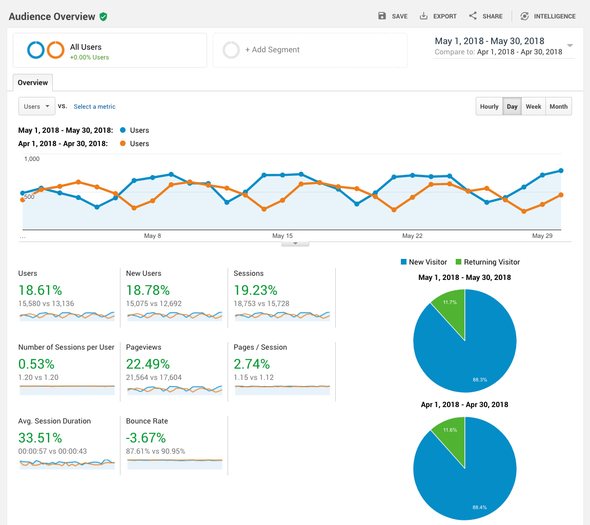
You can test and track with a metrics tool–the most widely used is Google Analytics. This tool will give you loads of valuable information about user behaviors, and allow you to set up goals to track conversion.
Above is a snapshot of data that only scratches the surface of what Google Analytics can provide!
If you have a WordPress website, you’ll be able to easily install a popular free plugin called MonsterInsights that connects your site easily to Google Analytics. If you need help with everything WordPress, check out Site Spark by FreshSparks.
Couple the data you gain from analytics with a digital advertising campaign, and you’ll be able to specifically target (and retarget) your online marketing to an audience that brings you business.
[click_to_tweet tweet=”A huge benefit of online marketing is the ability to easily test, track, and adjust. #smallbiz #marketing” quote=”A huge benefit of online marketing is the ability to easily test, track, and adjust.”]
MISTAKE #3
3. Unclear Brand Messaging
This may be one of the most underrated “bad website design” mistakes out there.
Messaging is a success factor for all the major big-name brands, but it needs to get on your radar if you’re a small business brand.
My prediction is that this will be the highest priority to focus on when avoiding web design mistakes in 2022.
If you can overcome this now, you’ll be ahead of the pack that’s scratching their head wondering why people are not “getting” their brand, or buying from them.
The key here is: storytelling.
What this means, is creating communication that is compelling to your audience and connects with them on an emotional level.
If you sound like every other company out there with generic messaging, why should people care?
In order to stand out, your message has to come from your brand vision, values and beliefs.
This is what will differentiate you from the competition.
Here’s the most important part:
Your website content has to address the needs and motivations of the target persona, not your own agenda or accomplishments.
Brand messaging should be framed to understand their decision-making process and what value you bring.
Do less talking about yourself, and more talking with the audience to solve their pain points. It’s a conversation that builds trust, which leads to more sales.
Dollar Shave Club is one of the most recently famous brand storytelling efforts that knocked it out of the part (to the tune of a $1B acquisition by Unilever).
Their first video set the tone for the brand voice, beliefs and value propositions in under 2 minutes, garnering 2.5 million views to date.
Think about how you can create something as amazing as that, translated into the personality of your website copy. It doesn’t need to be humorous, or outrageous—it just needs to be true to your own brand.
SEE ALSO – Brand Strategy Framework: A 5-Step Process To Help You Stand Out
MISTAKE #4
4. Weak Search Engine Optimization (SEO)
While you may think that badly designed websites mean the front-facing user experience is poor, it’s content that will make or break traffic and lead generation.
Great content provides exceptional value and gets found organically via search engines.
However, there is no magic formula to obtain high search engine rankings.
What’s more:
High ranking results definitely do not happen overnight.
Old school SEO used to be a mix of stuffed keywords, thin content, and oodles of haphazard backlinks (whether credible or not). Anyone making these web design mistakes can get penalized and lose site authority.
Search engine algorithms have grown to be a lot smarter than that, and value a site based on much more.
If there are a few key things to hone in on for search engine optimization, it’s these:
Focus on Long-tail Keywords
Long-tail keywords are the direction that user searches are heading–a more natural language approach.
You’ll have an easier time ranking for longer keyword phrases than short ones, and it will likely bring you more relevant leads.
For example:
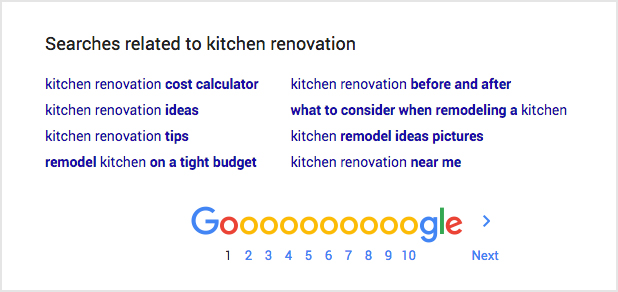
Instead of “kitchen renovation“, try this: “how much does a kitchen renovation cost“.
That specific consumer may be looking at pricing already–important information that you can provide to help start the relationship with your brand.
Other examples for long-tail keywords can be determined if you do an initial search on Google for the shorter keyword phrase (more commonly known as “head term”).
Take a look below at similar searches that users perform in relation to the term “kitchen renovation” when seeking information. You can find these at the bottom of the page after conducting a search on Google.
Post Quality Content Regularly
A stale website will not build the strongest relationships with potential or repeat customers. You must offer unique, informative and fresh content. This frequent, quality content is now highly valuable as an SEO practice.
The old adage is still true (and always will be): content is king.
Think seriously about including an active blog component to your website.
A blog will allow you to share articles about industry trends and helpful expertise. Give your potential customers value that will, in turn, gain their trust and build a brand.
Choose topics that provide useful information and engage readers, in a well-written format of at least 1,000 words (if not more).
SEE ALSO: How to Start a Successful Blog For Your Business
Encourage Social Engagement
One thing that your business can have over a large corporation, is the ability to connect personally with customers.
A good way to nurture these relationships is through social media sites like Facebook, Twitter, Instagram and Pinterest. These outlets are another way to strengthen your brand identity and customer service recognition.
Combine the blog posting with social sharing, and you’ve got a recipe for higher rankings on Google.
SEE ALSO: 7 Effective Social Media Best Practices for Business![]()
MISTAKE #5
5. Hard to Find Contact Info
Your business should be everybody’s business!
Customers and clients need to get in touch with you easily.
More often than not, website owners do not show their phone number prominently in the header and footer–or on a dedicated contact page.
This is one of the easiest web design mistakes to avoid.
Put a clear call to action in the header with the direct phone number (example: “Call for a free estimate today! 800-555-5555”).
If you don’t want to appear too sales-y in your header, then a simple “Call 800-555-5555” works just as well…or even just the phone number.
Customers do not want to work to find out how to get in touch with you from the web.
Minimize the clicks, maximize the opportunity!

Add a “Contact Us” page link in the main navigation.
Allow users as many ways to contact you as possible–phone, email, contact form submission…even via your Facebook or Twitter page. Always reply promptly to solidify initial trust in the relationship.
Again, there is no need to get creative with the wording of the Contact link in the main navigation. Your audience is specifically looking for a Contact page.
MISTAKE #6
6. Slow Load Times
If your website loads slowly, you will most certainly lose the visitor. By slow, I mean anything that takes above 3 seconds to load.
Everyone wants to find their information fast.
According to Google, 53% of mobile site visits leave a page that takes longer than three seconds to load.
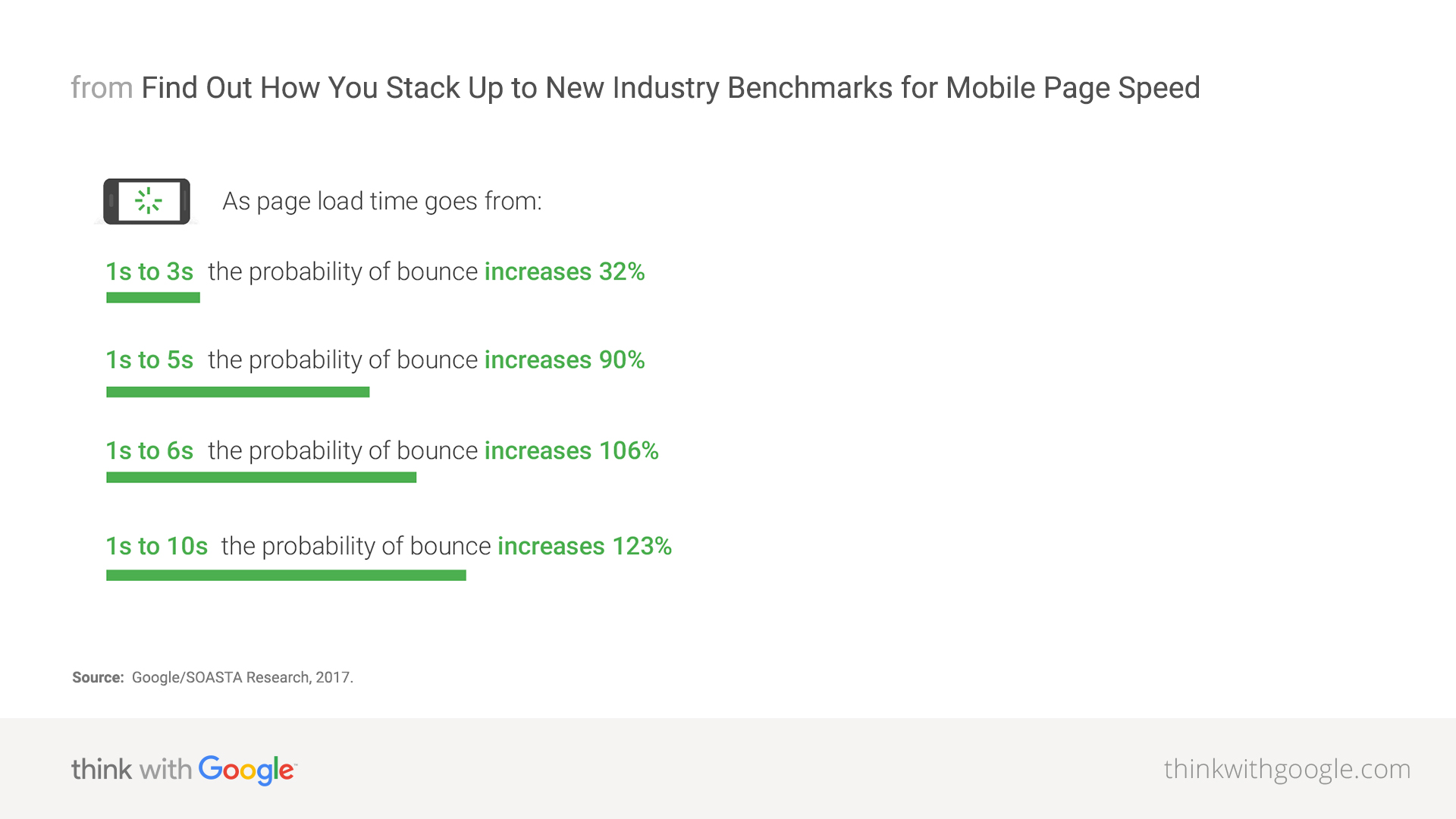
Remember how I talked about having strong SEO for your website above? Well, a slow page load time can significantly affect your search engine rankings.
This website mistake can be a technical issue. Therefore, it’s important to get your developer involved to find ways to improve the page load time for an existing website.
For a new website design, ensure that having a fast load time is at the top of your list when you provide requirements to your web designer or creative agency.
MISTAKE #7
7. No Mobile Site Experience
This is a biggie in the world of web design mistakes.
A customer’s impression of your website design is now contingent on what it looks like from their handheld device.
People are constantly connected nowadays.
Most consumers are using their smartphone browsers at a rate almost higher than desktop use (mobile usage was forecasted to surpass desktop in 2015).
Take a look at the following data from the Google Mobile Playbook.
If your site does not have a mobile-friendly experience, consider it a priority.
40% of users have gone to a competitor’s website after a poor mobile experience.
Because users are looking for the optimal experience, they will continue to look for the best one for them. This means your competitors may have a leg up on you.
57% of users say they will not recommend a business with a badly designed mobile site.
With the power of reviews and referrals fueling a consumer’s decision-making, you’ll want the recommendations. Make it easy to create a lasting impression with a mobile-friendly experience.
67% of users say they are more likely to buy a product from a mobile-friendly site.
Offer a consistent experience on all devices–desktop, tablet, and especially mobile.
With over 50% of traffic coming from mobile and 21% of those consumers converting, your business cannot afford to go without a mobile presence.
Consider a responsive web design for mobile, which is an optimal experience and Google-approved for SEO!
SEE ALSO: Why Responsive Web Design is Important and Google Approved
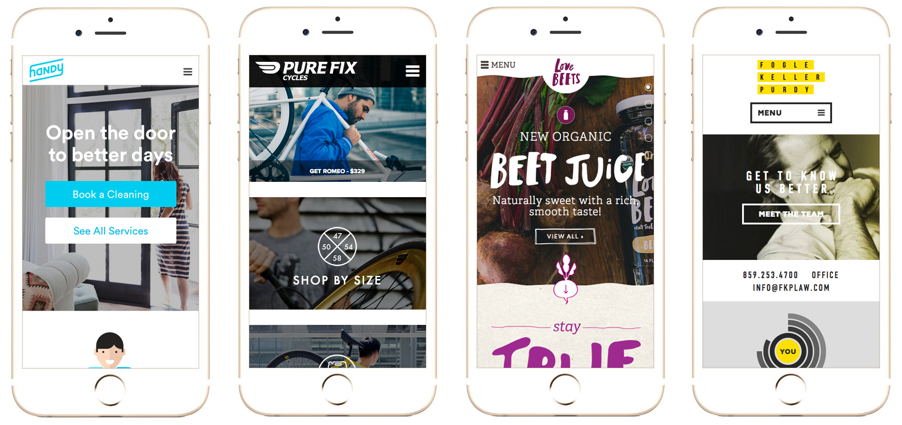
Check out these small business mobile websites on your smartphone, and compare the experience to desktop. The responsive web design presents a seamless experience. Left to right: Handy, Pure Fix Cycles, Love Beets, Fogle Keller Purdy.
Don’t Be One of Those Badly Designed Websites
Bring in more business with these quick and easy solutions to fix some of the biggest website mistakes. Include the following best practices when designing a new website:
- Use a strong call to action that drives users down a path.
- Measure website analytics by having Google Analytics installed.
- Offer crystal clear messaging to the right audience.
- Publish blog content regularly, focus on long-tail keywords and share it on social media.
- Put a visible phone number in the header, and on the contact page.
- Optimize page load times to keep visitors engaged.
- Ensure your website has a mobile-friendly experience.
With all the things to juggle as a business owner, consider hiring a professional web designer. They can help ensure your website generates leads for your business, by providing an optimal user experience for your customers. And more importantly, avoiding all the common website design mistakes.
In addition to web design and development, the right creative partner should be able to provide consultation on the appropriate content marketing to draw an audience, effective search engine optimization methods, and a successful social media strategy. If an agency is also experienced in branding services, even better.
Are you guilty of any website design mistakes?
Don’t be shy – tell me in the comments below!
If you loved this post, please share it. 😊
FreshSparks is a branding agency specializing in brand strategy, brand identity, and brand marketing. We can help you excel with your positioning, point of view, and presentation to make an impact on the right people from awareness to conversion to retention. It’s the perfect mix of building a long-term brand with purpose so that you can make a profit.
Book a consultation to learn more.

Sonia this article is so helpfull. Tnak you!
Don’t ignore the users and UI part, don’t create a cluttered layout, don’t use all the colors, don’t fill the page with long paragraphs, don’t make it hard for users to find what they need, make their life easy, the more easy is for the user, the better is for anyone to browse, and that will help you in turn increase your revenue / leads. Contact one such company I know https://www.alakmalak.com/?utm_source=sj who can help you build website that can convert.
Good article! I started to analyze the site and my work. I think he’s good, but there’s always doubt. I would like to ask you to leave a review, what do you think? Here is the site https://fieldworkhq.com/
Nice information for a new blogger…it is really helpful
lets do it, link it emdfurniturecenter and you can learn more furniture
Hi! Thank you for this content! This is excellent!
Maybe retitle this. “2020” and add fresh content
Hi, I would like to add another important point for while designing. That is Google analytics and another one is search console these both are very important for the website. So only we can check website errors through search console and also can track user behavior at google analytics. Also, I agree with rest all. Thank you for this wonderful article very useful for who into website design and development.
Sir! This is an epic guide!!. Long and valuable for every newbie bloggers including me. Thanks… ?
I really like your blog posts, very informative, and easy to digest. I think I will definatly be borrowing some of your wisdom, thanks
One of the most common mistake that every designer will do is they will forgot to add google analytics code to the website which results in the loss of tracking of website visitors, landing pages and the bounce rate. As soon as we developed a website we should add the google analytics code under the head section of our website. These 5 tips will definitely help apart from this I went through a similar post 5 Things to Avoid When Designing a New Website and it was very helpful to me.
Thanks for sharing your article. Really Informative and useful. I had read also one more same article. which you can read here: 6 MISTAKES YOU ARE MAKING ON YOUR WEBSITE
Thanks for this nice article, while redesigning website this points very usefully to improve and get more customers.
I have the same article on this mistakes is here – 5 Biggest Webdesign Mistakes while Redesigning
yeah totally agreed with you if we focus on these mistakes then our user never want to leave our website
These are the most important steps need to consider to avoid web designing mistakes. It is more effective information.
These are the mistakes you should avoid making when designing your website. For professional web design, work with a reputable web design company.