Some businesses always manage to seem relevant and have a strong position in the market, like they’re one step ahead of the game. This can be due to a commitment to innovation and brand refresh.
A brand refresh is more of a strategic makeover than a total transformation. It’s about updating what’s already working – not starting from scratch.
Even the biggest names, from Google to Pepsi, have given themselves a glow-up when they needed it.
But for brands that big – why bother, you ask?
Ultimately, a brand refresh is about staying relevant.
It’s how a business brand can keep up with the times and resonate with new audiences, but without losing its core identity.
In this article, I’ll dive into
… the what, why, and how of a brand refresh,
… each step of the brand refresh process, and
… brand refresh examples from companies that nailed it (and some that didn’t understand the assignment).
By the end, you’ll have a solid understanding of what goes into a brand refresh strategy and when it’s worth considering.
Table of Contents –
- What is a Brand Refresh?
- 5 Interesting Brand Refresh Examples
- Brand Refresh vs. Rebrand: The Major Differences
- A Few Epic Brand Refresh Mistakes
- Is a Rebrand Best for Your Business?
- The Brand Refresh Process & Checklist
62% of millennials and Gen Z prefer brands that are transparent, authentic, and keep up with trends. (Source: Nosto)
Let’s start with a basic definition of what a brand refresh is.
What is a Brand Refresh?
A brand refresh is like giving your business a style update – not a full makeover.
You’re not completely changing who you are or how you are perceived; you’re just showing the world that you’re evolving.
Just as people will upgrade their wardrobes or hair to stay in style, brands need a refresh once in a while, to stay relevant.
This might mean
- updating a logo,
- tweaking the color palette,
- modernizing fonts, or
- rethinking messaging to better connect with today’s consumers.
But why a refresh instead of a complete rebrand?
A brand refresh is meant for when a company’s core identity still holds, but the look, feel, and experience might be a bit stale or dated.
A rebrand, on the other hand, is necessary when you have customers who don’t totally understand what you do, or you’re not known for the right things.
Rebranding requires a full transformation—think of it as reinventing yourself entirely, which is much more drastic.
With a brand refresh, you’re simply polishing up what’s already there, which can be effective in keeping your brand relevant without losing its established appeal.
Brands that undergo a brand refresh generally see an increase in revenue thanks to renewed customer interest and engagement.
5 Interesting Brand Refresh Examples
Here are some more noteworthy examples of brands that freshened themselves up in ways that kept them relevant and engaging:

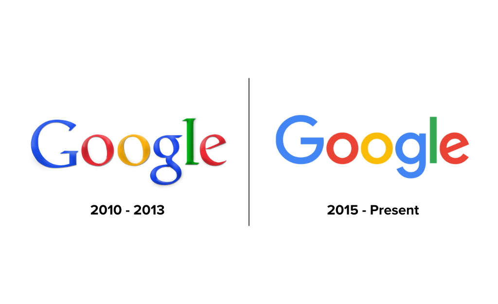
1. Google
Let’s take Google’s subtle logo update in 2015. Instead of overhauling everything, they refined their logo with a cleaner, modern font, adapting to the digital-first world while keeping their identity intact.
According to Google –
“The Google logo has always had a simple, friendly, and approachable style. We wanted to retain these qualities by combining the mathematical purity of geometric forms with the childlike simplicity of schoolbook letter printing. Our new logotype is set in a custom, geometric sans-serif typeface and maintains the multi-colored playfulness and rotated ‘e’ of our previous mark—a reminder that we’ll always be a bit unconventional.”
This was a brand refresh that kept the essence of Google but gave it a more contemporary look, making it clear that even giants need a little update now and then.
2. Burger King
Did you see Burger King’s recent brand refresh? Or realize they even had one?
It’s a bold, retro-inspired update that marries nostalgia with simplicity. Launched in early 2021, the refresh brought back a vintage-inspired logo reminiscent of the brand’s look from the 1960s and 1970s, signaling a return to its roots with a modern twist.
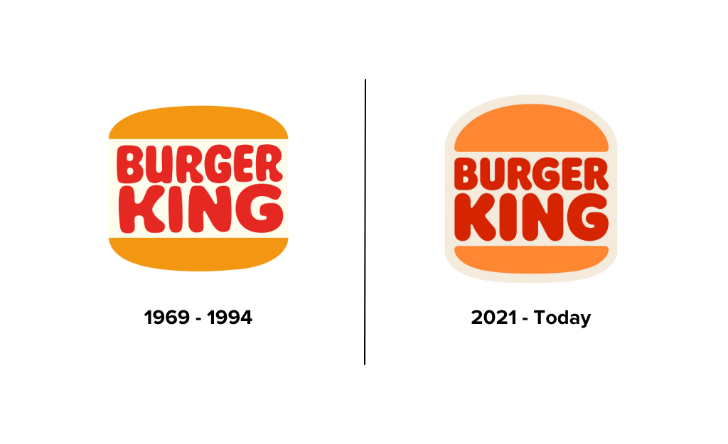
The logotype is subtle but has an impact by elevating the visual look and feel of the symbol, color, and font.
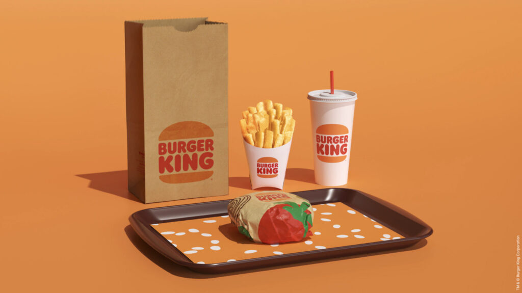
This brand refresh was a smart move that modernized Burger King’s image, making it relevant for today’s fast-food landscape without losing the quirky personality fans love.
3. Fisher-Price
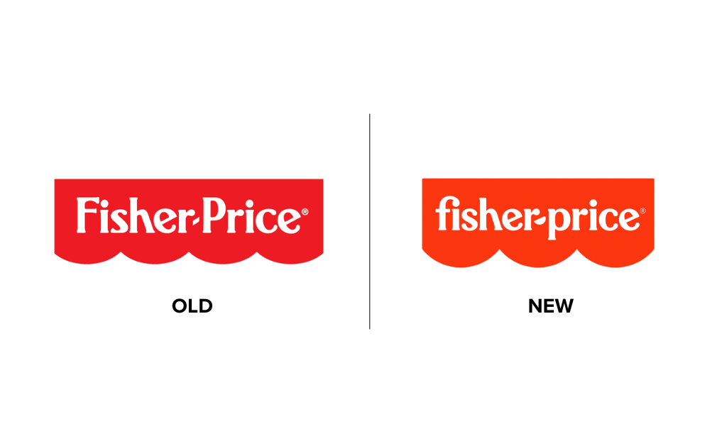
Fisher-Price recently hit the refresh button, giving their iconic brand a playful yet polished update.
Their signature “smile” stayed (thank goodness because, let’s be honest, we would all miss it) – but the logo got a cleaner, more modern twist.
The refresh didn’t stop there—packaging got brighter, simpler, and totally in tune with today’s parents while keeping the timeless Fisher-Price charm.
This is a perfect example of how a little glow-up can keep you relevant without losing what makes you – you.
4. Instagram
Instagram’s 2016 logo update is a simple yet impactful example of a brand refresh that balanced the familiar with a new, modern look.
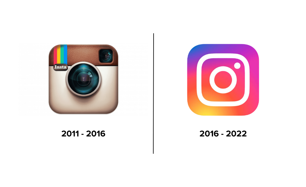
By changing from a skeuomorphic icon to a gradient-filled, minimal logo, Instagram reflected a shift toward simplicity that matched the design trends of the time.
The new logo was still instantly recognizable, showing that a well-executed refresh doesn’t need to reinvent the wheel to feel fresh and relevant.
5. GoDaddy
GoDaddy underwent a brand refresh to shed its outdated image, adopting a friendlier, more professional logo and messaging approach to better connect with small businesses and startups.
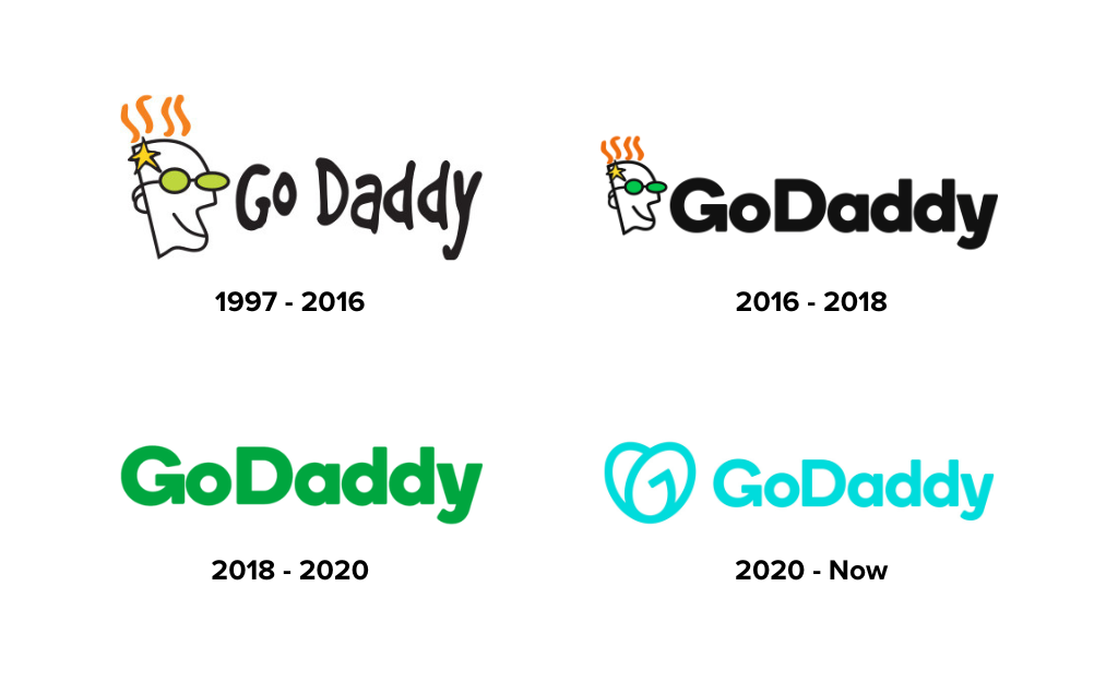
The brand retired the “cartoon guy” in favor of a more inclusive symbol that better captures its diverse entrepreneur audience.
The classic GoDaddy green was switched out for a more modern palette of bright and bold colors.
“Inspired by the courage, creativity and grit of our customers, GoDaddy came up with a logo that captures the essence of entrepreneurial spirit, pays homage to the importance of humanity, and exudes a feeling of joy.”
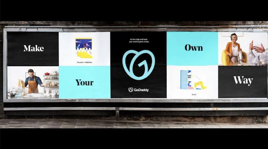
This brand refresh allowed GoDaddy to communicate its growth and professionalism while staying true to its mission of empowering business owners of every kind.
Each of these brand refresh examples shows that a refresh doesn’t mean losing sight of who you are.
Instead, it’s about being flexible with how you connect with today’s audience and making sure your brand looks and feels as current as the products or services you offer.
Brand Refresh vs. Rebrand: The Major Differences
Now that we’ve looked at a few brand refresh examples let’s dig a bit deeper into the differences between the two.
A brand refresh means making updates and adjustments without losing your brand’s core identity. It’s like updating the paint color, curtains, and couch in your living room because it feels like time for something more modern.
A rebrand, on the other hand, is like knocking out a couple of walls and majorly renovating because your family has changed and your current home layout doesn’t fit anymore.
Rebranding means a complete overhaul, usually involving a shift in identity, target audience, and even company values.
Knowing when to choose one over the other is key.
A BRAND REFRESH is the way to go if your business still has a strong, recognizable core identity but needs polishing up.
The Google, Burger King, and Fisher-Price logo updates are perfect examples of a refresh; they modernized their look to keep up with a changing digital landscape while preserving the brand’s recognizable features.
If your business has changed direction, audience, or mission (or it was never defined), it might be time for a REBRAND.
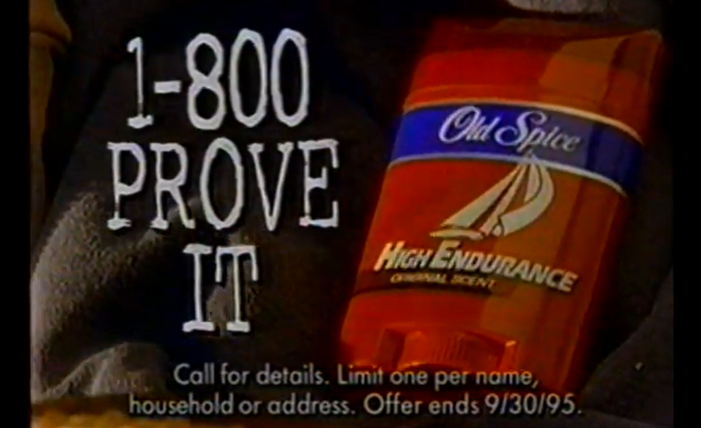
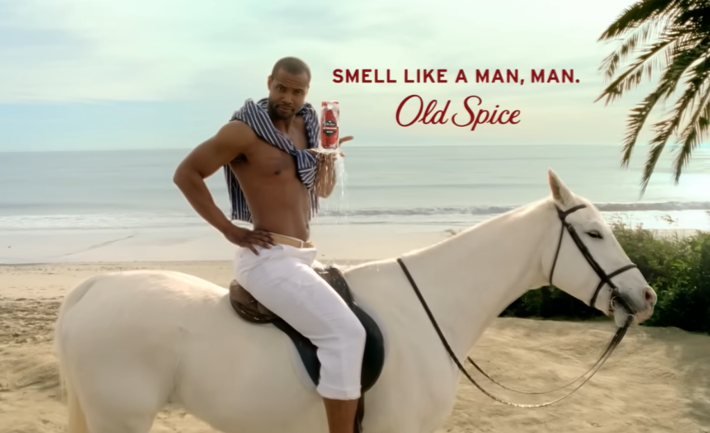
Old Spice is a classic example of this: they transformed from a classic “dad” brand to something bold, youthful, and unexpected, targeting a whole new generation.
So, when considering brand refresh vs. rebrand ask yourself: does the brand need a tune-up, or a full identity shift?
If it’s just a matter of updating your look or tweaking a message to better connect with today’s consumers, a refresh will get the job done.
If you need to signal a bigger shift, that’s when a rebrand might be necessary.
Read More: 11 Simple Steps for a Successful Brand Building Process
A Few Epic Brand Refresh Mistakes
A brand refresh can fail, no matter how big the brand. Here are some well-known examples of brand refreshes that missed the mark…
These brand refresh “flops” demonstrate the importance of understanding customer expectations, brand legacy, and effective communication during a refresh.
Take a look at a few notable brand refreshes that didn’t go as hoped:
❌ Tropicana
In 2009, Tropicana launched a brand refresh that included a major overhaul of its iconic packaging. The brand replaced its recognizable “orange with a straw” image with a more minimalist design and changed the font and logo.
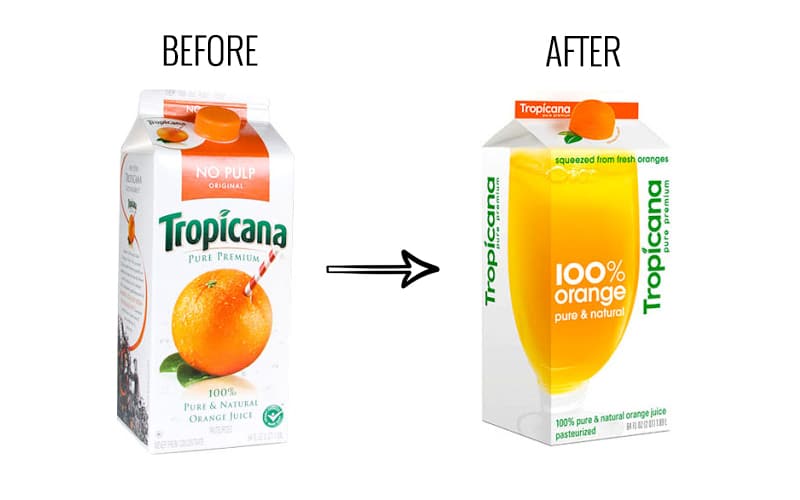
Sales dropped by 20% within a couple of months, losing the brand about $30 million. The backlash forced Tropicana to revert to its original design.
This loss was on top of the $35 million invested in advertising and promotion of the new brand packaging!
Within a mere few months, the brand returned to its original packaging on all supermarket shelves.
The Tropicana brand refresh failed because it discarded a visual that was strongly associated with the brand’s identity, confusing loyal customers and causing enormous backlash.
❌ Gap
Gap’s logo refresh in 2010 is infamous for how quickly it backfired. The new logo, which featured a plain Helvetica font with a small blue square, was intended to modernize the brand.
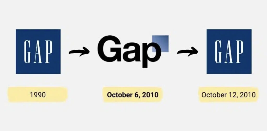
Instead, this change was widely criticized for being generic and uninspired.
Social media backlash was so intense that Gap abandoned the new logo within a week and reverted to the original design.
The lesson here is that brand icons with a strong identity don’t need drastic changes—customers felt like the refresh took away Gap’s essence without adding anything new.
❌ Mastercard
While Mastercard’s 2016 logo refresh ultimately succeeded, its initial reaction was polarizing. The brand modernized its iconic red and yellow circles, but its updated, flat design initially left some consumers confused, as they didn’t immediately recognize it as Mastercard.
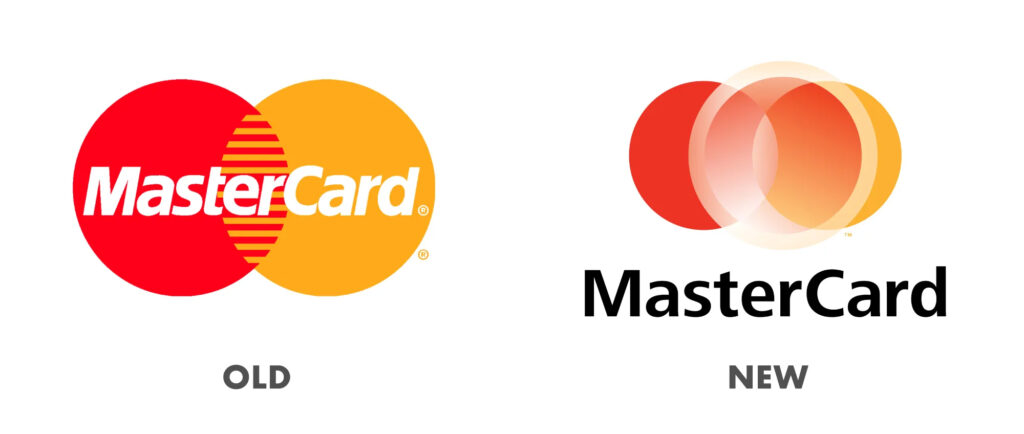
This shows that even subtle changes can disrupt brand recognition if they remove essential elements too quickly.
The big mistake was following the input from board-level stakeholders instead of considering their audience.
Mastercard later adapted its new brand visuals into a more recognizable design, striking a balance between fresh and familiar.
These brand refresh mistakes show that changing a brand’s visual identity without carefully considering customer loyalty, clear communication, and strategic execution can lead to negative responses.
Remember: a successful brand refresh should enhance, not diminish, what makes the brand memorable and meaningful to its customers.
Is a Rebrand Best for Your Business?
At the end of the day, keeping your brand relevant comes down to knowing when it’s time for an update or a total makeover.
To demonstrate the difference between an update (brand refresh) and a makeover (rebrand), here are three examples of companies that successfully changed their identities to match new missions, audiences, or markets:
🏆 Dunkin’
New audiences, new name
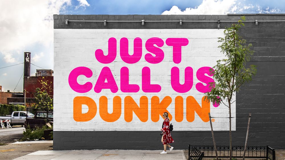
Dunkin’ Donuts rebranded as simply “Dunkin’” in 2018, reflecting its shift from being solely a donut shop to a full-service coffee and quick-bite destination.
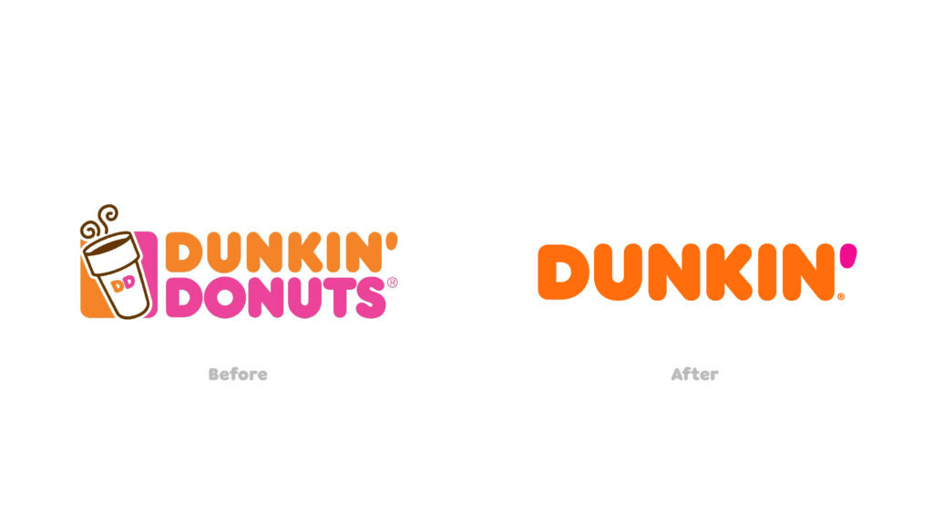
Losing the “Donuts” supported its more diverse product line, adopted vernacular (Example: “I’m grabbing coffee – want anything from Dunkin’?”), and the on-the-go demand from consumers.
This strategic rebrand attracted a broader customer base, aligning with its new focus on convenience and quality coffee—while still retaining loyal, long-time customers (like me)!
🏆 Old Spice
New audience, new messaging

Old Spice’s transformation from your dad’s after-shave brand to a bold, humorous, and youthful icon connected it with a younger, style-savvy audience.
The rebrand completely revitalized Old Spice, turning it into a pop culture phenomenon and increasing its appeal across generations.
The company only slightly changed the traditional logo, while focusing more on the messaging and overall brand experience.
Their sales more than doubled in the year after the rebrand – impressive!
🏆 Mailchimp
New markets, new audiences
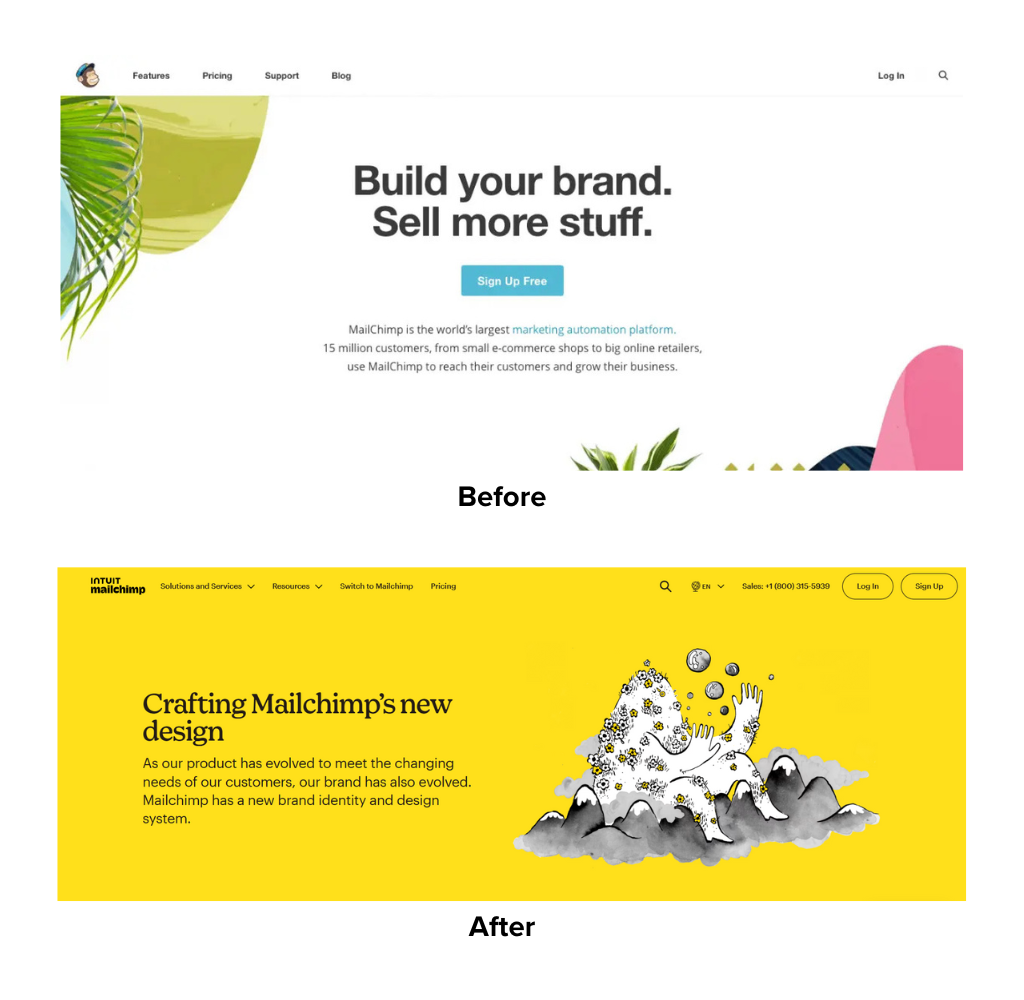
Mailchimp, originally known for its quirky, friendly brand, rebranded in 2018 to support its growth from an email service into a full marketing platform.
This rebrand included a new color palette, updated typography, and a more sophisticated look that still kept its fun personality. They also slightly tweaked the name from MailChimp with a capital “C”, to Mailchimp with a lowercase “C”.
According to Mailchimp –
“With this redesign, we set out to retain all the weird, lovable elements that endeared our earliest customers to Mailchimp, while creating space for the brand to grow and connect with even more small businesses.”
These examples show how a brand refresh can keep a brand looking current without altering its core identity, while a rebrand allows a brand to completely redefine itself.
Whether your brand just needs a little polish or a full transformation, understanding the difference between a brand refresh and a rebrand is key to staying relevant and resonating with your audience.
If you’re considering an update, a brand refresh agency can help you make the right choice and navigate the process, ensuring that whatever changes you make truly elevate your brand.
The Brand Refresh Process & Checklist
While I may have made it sound overly simple, make no mistake—a brand refresh isn’t just about redesigning a logo or adding a new color.
It requires a brand refresh strategy that carefully considers all elements of your brand to decide what stays, what goes, and what gets an update.
Here’s a basic brand refresh checklist to help make sure you’re covering all the essentials.
✅ Brand Assessment and Strategy
Start by evaluating your current brand assets. What looks good, and what feels outdated? This is the time to consider any shifts in your audience’s preferences or industry trends.
Knowing the “why” behind the brand refresh sets a solid foundation.
Ask important questions like:
- Does our current branding align with our values and mission?
- Is our look and messaging resonating with our target audience?
- Are there any aspects of our brand that feel out of date?
With answers to these questions, map out your brand refresh strategy, so you know what to prioritize. If you get stuck at this step, consider reaching out to a brand refresh agency.
✅ Design and Visual Updates
Once you have a clear strategy, it’s time to refresh your visuals. This could mean updating your logo, color palette, fonts, or even photography style.
Remember, the goal is to create a fresh look without losing brand recognition.
For example:
- Can the logo use a modern tweak while keeping its recognizable elements?
- Are there new colors that better capture the brand’s vibe?
- Would updated fonts make the brand look cleaner and more contemporary?
This isn’t just saying, “We should use purple for our logo because purple is trending.”
You want to make sure there is meaning in the refresh so it maintains its brand integrity. You’ll want to work with a brand designer who understands how to work with a brand refresh strategy.
✅ Messaging and Voice Tweaks
Just as visuals need a little sprucing up, so does brand messaging. Review your taglines, mission statements, and core messaging to ensure they resonate with a modern audience.
Messages are a way to keep the brand voice relevant and engaging.
Some questions to ask:
- Is our tagline still connecting with today’s customers?
- Does our messaging need to be simpler, bolder, or more inclusive?
- Are there ways to reflect current trends without losing the brand’s essence?
Language shifts and evolves over time. If there’s any concern at all that your messaging could sound racist, sexist, homophobic, ableist, or offensive to any group of people, you’ll want to update as necessary.
✅ Internal Alignment and Rollout
Before unveiling the refreshed brand to the public, make sure everyone on your team is aligned with the changes.
Key points to consider:
- Highlight what’s new and what’s staying the same. Transparency builds trust and ensures your team embraces the changes.
- Develop a detailed plan for unveiling the new brand. Don’t forget to include internal updates, external announcements, and communication in your marketing efforts.
- Double-check that all materials—from your website to social media and print—reflect the updated brand.
This step is crucial in ensuring that the refresh is consistently represented across all touchpoints.
Plan the brand rollout carefully and communicate the changes clearly to your audience, highlighting what’s new and what’s staying the same.
In Conclusion
A brand refresh is like changing your hair for something more on-trend—it keeps things fresh and current without losing your personality.
It’s perfect for brands that just need an update to stay modern and connected with their audience.
A rebrand, though, is a whole new vibe. This is where you rethink your identity from the ground up, usually because your business has grown, your audience has changed, or you need to shift the way people see you.
Rebranding is bold, and it’s perfect when you need to redefine who you are and what you stand for.
The key takeaway…
A brand refresh keeps you polished, while a rebrand lets you pivot.
Whether you’re ready for a subtle touch-up or a big transformation, finding the right path means knowing your brand’s needs and goals.
Although it will require a healthy investment, you don’t need to spend millions of dollars on a successful brand refresh.
And if you’re not sure where to start, FreshSparks can help. As a trusted brand refresh agency, we’ll work with you to keep your brand relevant, engaging, and memorable.
Get in touch to find out how we can help you Brand Up and Stand Out.
FreshSparks is a branding agency specializing in brand strategy, brand identity, and brand marketing. We can help you excel with your positioning, point of view, and presentation to make an impact on the right people — from awareness to conversion to retention.
It’s the perfect mix of building a long-term brand with purpose so that you can make a profit.
Leave a Reply