Creating the best nonprofit website design and brand experience can be a challenge for both new and mature organizations.
Here’s why:
Impactful web design for nonprofits must be more than just a digital brochure, but less than a hungry online sales machine!
And beyond being on a budget, nonprofits often have to find a way to make their cause very relevant to a niche target audience. An audience that is also being targeted by oodles of cause-based e-commerce, and for-profit businesses.
It comes down to creating brand awareness with a compelling brand strategy and online identity.
In a world consumed by social media activity, viral campaigns offer temporary exposure for some nonprofits. However, this doesn’t make up for a weaker web presence that focuses only on facts, data and an organization’s agenda of action items.
The best nonprofit websites need to:
- tell a story for brand building
- share the impact on their cause
- engage users and solicit action
So, how do you deliver this experience?
Let’s address this common question first:
What should a nonprofit website design include?
An effective nonprofit website design should act as a brand awareness tool to create excitement around a cause and to generate continued support.
When designing a nonprofit website, organizations need to ensure that their brand story is being told. And, that the brand identity is showcased properly using design elements from brand style guidelines.
At the end of the day, the same elements of business branding should apply to a nonprofit.
There are many answers to the question “what should a nonprofit website design include?” It can differ for each organization’s goals, from a user experience, branding, and marketing standpoint.
How to Build Your Brand Strategy
Purpose, positioning, personality, point-of-view…it’s all covered in this online masterclass. Learn to create a powerful blueprint that will transform your organization into an extraordinary brand that stands out!
If you are looking for nonprofit website design examples and best practices, here are a few must-have website features to consider.
(I’m going to assume that you’ve developed an impactful brand purpose, mission, vision, and values for your non profit organization before diving into website design!)
1. Engaging images, graphics, and video
Visuals to support brand storytelling is key when you create a nonprofit website design.
Did you know:
The brain processes visuals 60,000 times faster than text!
This means that your content is much more compelling and engaging when your nonprofit website design includes high-quality:
- Photographic imagery
- Infographics showing data or process
- Videos and vlogs
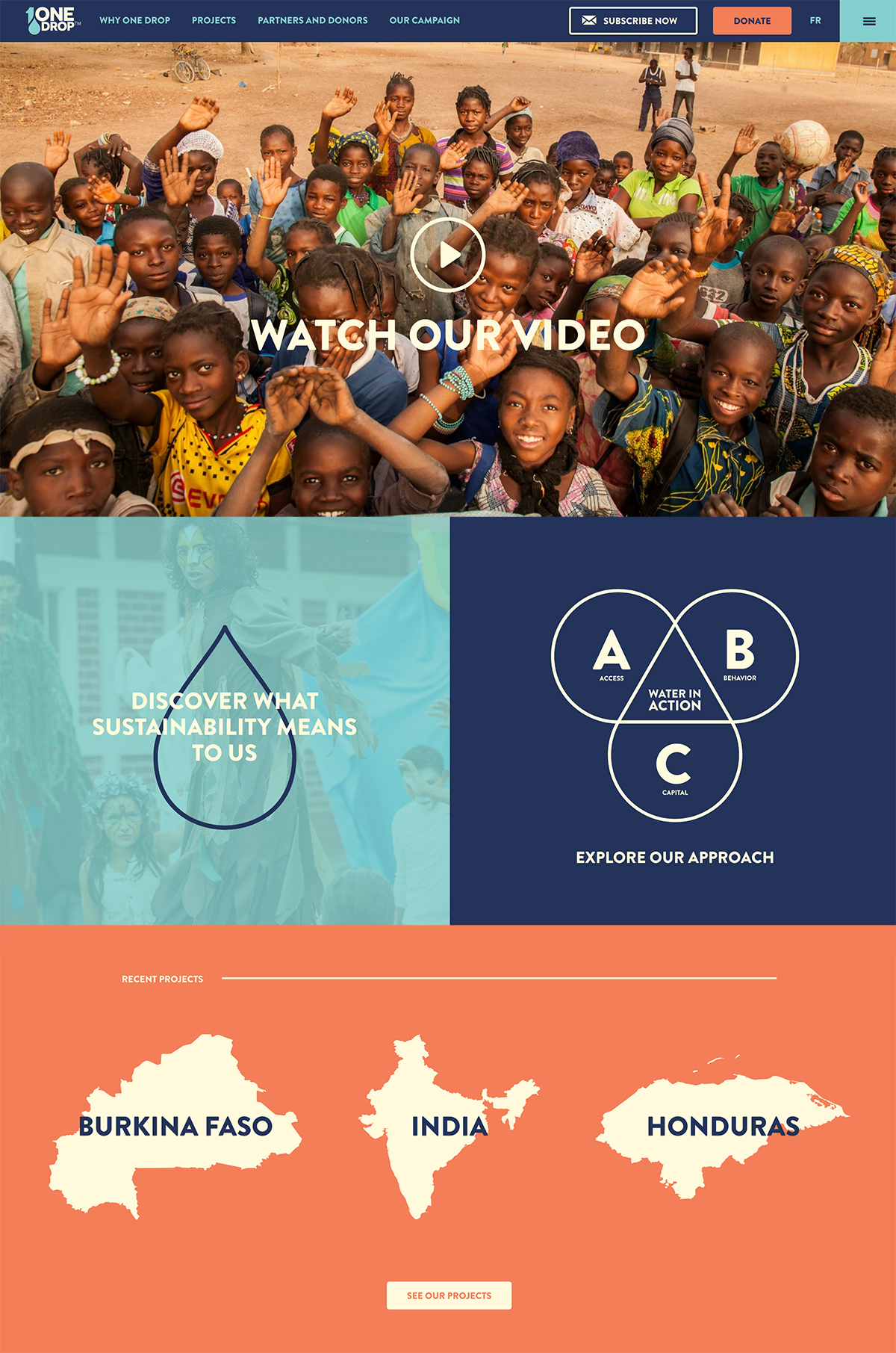
The nonprofit web design for One Drop is highly engaging and draws you in with bright imagery, graphics, and video.
Visual content can result in visitors spending more time on your website. This is a great website design tactic for search engine optimization! A user’s time on site can be a positive (or negative) signal for Google, thereby affecting ranking in search results.
2. Effective use of white space
Now, you are probably thinking that this is a throw-away tip.
But hear me out:
White space for a web design doesn’t necessarily have to be “white”. It’s a way to add breathing room around the content on your nonprofit website design to improve user experience and brand perception.
Here’s an example where the design includes a nice amount of white space, even though it uses dark photography and color/texture in the background.
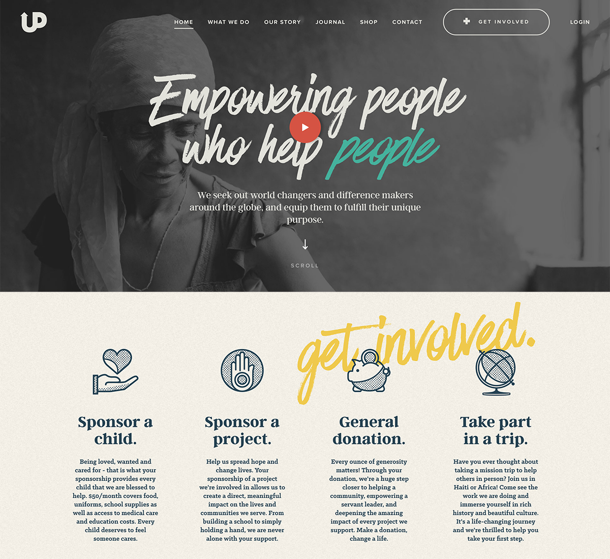
Source: Upstream International
Studies have shown that a website design with ample white space enhances things like:
- Comprehension of information (Lin, 2004)
- Customer satisfaction and delight (Chaperro, Shaikh, and Baker, 2005)
- Prominence/focus on content or products (Olsen, 2002)
- Trust and credibility (Stanford University, 2004)
3. A prominent, global Donate button
If you are ready to join a cause or contribute with a donation, what is the first thing you look for on nonprofit website design?
That’s right:
The big ol’ DONATE button.
This may seem so obvious. However, in our research, we found this key call-to-action (CTA) hidden or missing on numerous top nonprofit websites!
In fact, many websites out there lack a good, clear call-to-action.
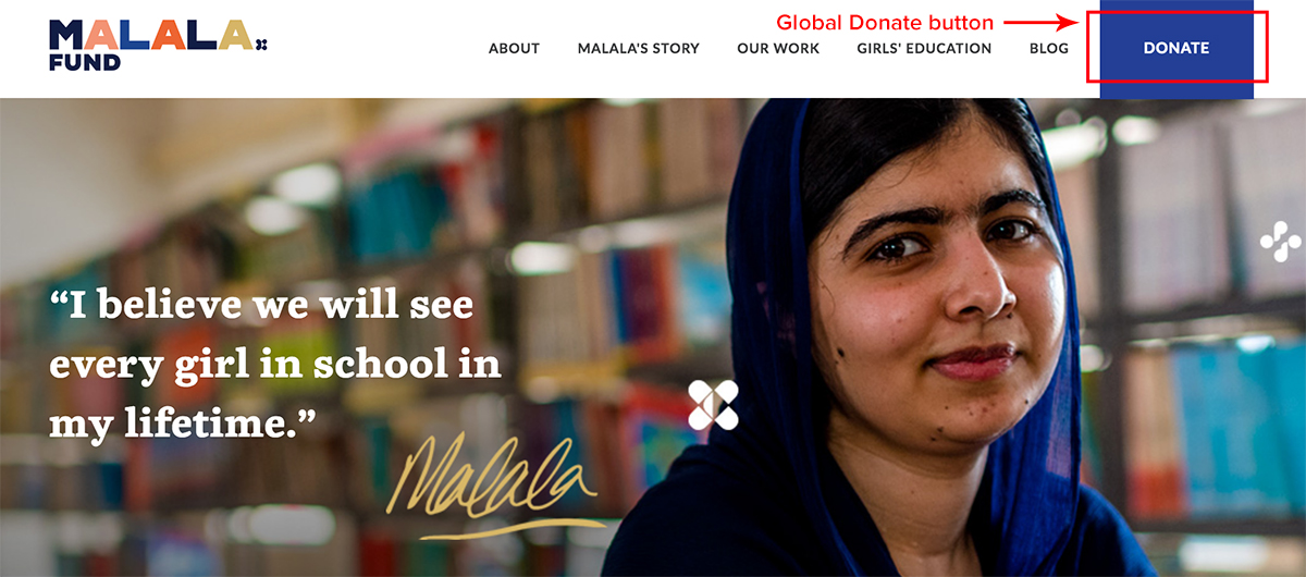
Source: Malala Fund
Think about how prominent the Join or Donate button should be for your particular nonprofit website design and user experience.
Should it be a link in the main navigation?
Or should it be pulled out on its own as a big colored button that attracts clicks?
One thing is for sure: make the Donate button easy to find for potential donors!
In the case of a for-profit business, this call-to-action should represent the most important thing your customer should be doing when they visit your website. Is it to buy now? Or to schedule a call? Think about the right directive and, well, be direct!
SEE ALSO: 5 Most Common Website Design Mistakes To Avoid
[click_to_tweet tweet=”Think about how prominent the Donate button should be for your particular nonprofit website design and user experience. Make it easy to find for donors! #nonprofit #UX” quote=”Think about how prominent the Donate button should be for your particular nonprofit website design and user experience, but make it easy to find for donors.”]
4. Responsive design for desktop and mobile devices
These days, most users are accessing their browser from a mobile device.
In fact:
Website traffic from mobile browsing has already surpassed that of desktop browsing!
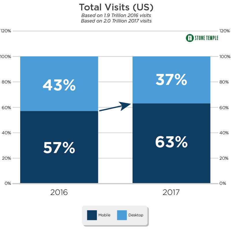
Source: Stone Temple
Be aware of what percentage of users on your nonprofit website are visiting from a mobile device. You’ll be able to see what this data actually is, by looking at Google Analytics.
From there, determine whether you need a truly mobile-first strategy. Or, simply a consistent user experience for all devices with effective responsive web design.
SEE ALSO: Why Responsive Design is Important and Google Approved
5. Strategic search engine optimization (SEO)
First things first, ensure that Google Analytics is installed on your not for profit website. It’s the fastest, easiest and most cost-effective (read: free!) way to gather ongoing data about site traffic, visitors, behavior…and more.
Successful SEO is not a one-time implementation, rather an ongoing activity that occurs on a regular basis. This ensures the best results for your investment over the long-term.
Key areas to focus on with SEO are:
- Researching competitors to leverage opportunity
- Focusing on long-tail keywords
- Publishing quality content on a regular basis
- Encouraging engagement via social media
- Building high-quality backlinks to your site
[click_to_tweet tweet=”Successful SEO is not a one-time implementation, rather an ongoing activity that occurs on a regular basis. This ensures the best results for your investment over the long-term. #nonprofit #SEO” quote=”Successful SEO is not a one-time implementation, rather an ongoing activity that occurs on a regular basis. It ensures the best results for your investment over the long-term.”]
6. Consistent blog content publishing
Consistently adding new and informative content to your nonprofit website design is important for successful SEO and building traffic.
Most importantly, it nurtures relationships and creates trust with current or future members of your community.
A nonprofit website blog might include this type of content:
- Important updates about the organization
- Recent efforts to help the cause
- Trends or news stories about the cause
If your nonprofit is blogging consistently, you have a way to potentially generate 67% more leads!
[click_to_tweet tweet=”Consistently adding new and informative content to your nonprofit website design is important for successful SEO and building traffic. #nonprofit #marketing” quote=”Consistently adding new and informative content to your nonprofit website design is important for successful SEO and building traffic.”]
The above six elements are the most common ones to include in a top-notch nonprofit website design. However, there are others that you might implement to enhance the user experience, such as:
- An accessible, easy-to-find Search box
- Concise copy with relevant call-to-action
- Events page to encourage community engagement
- Lead generation through forms and popups
Best Nonprofit Website Designs in 2021
Now that you’ve reviewed some nonprofit website best practices, you may still be wondering where to start for a new website or redesign effort.
Take a look at these nonprofit website design examples and best practices!
Monterey Bay Aquarium Seafood Watch
Brand mission: To help people make better seafood choices for a healthy ocean.
Monterey Bay Aquarium Seafood Watch is an informational nonprofit website design with an accompanying mobile app that provides sustainability ratings for various seafood.
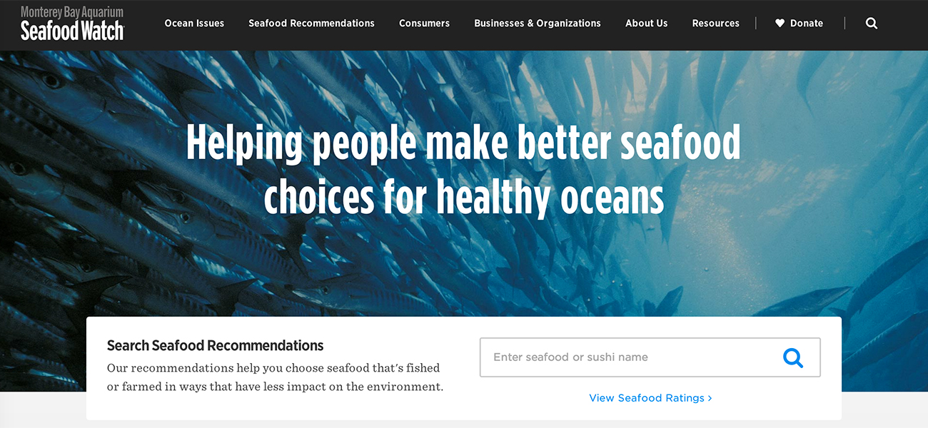
Their rating system has three simple levels: avoid, good alternative, and best. The website exhibits a good amount of targeted information sorted based on the user’s interest.
You can see this in the main pillars of their global navigation:
- Ocean Issues
- Seafood Recommendations
- Consumers
- Businesses and Organizations
The design for this nonprofit website inspiration displays attention to detail with engaging imagery that tells a story. Clear call-to-action areas stand out with blue hyperlinks to keep users engaged.
And, it has great white space!
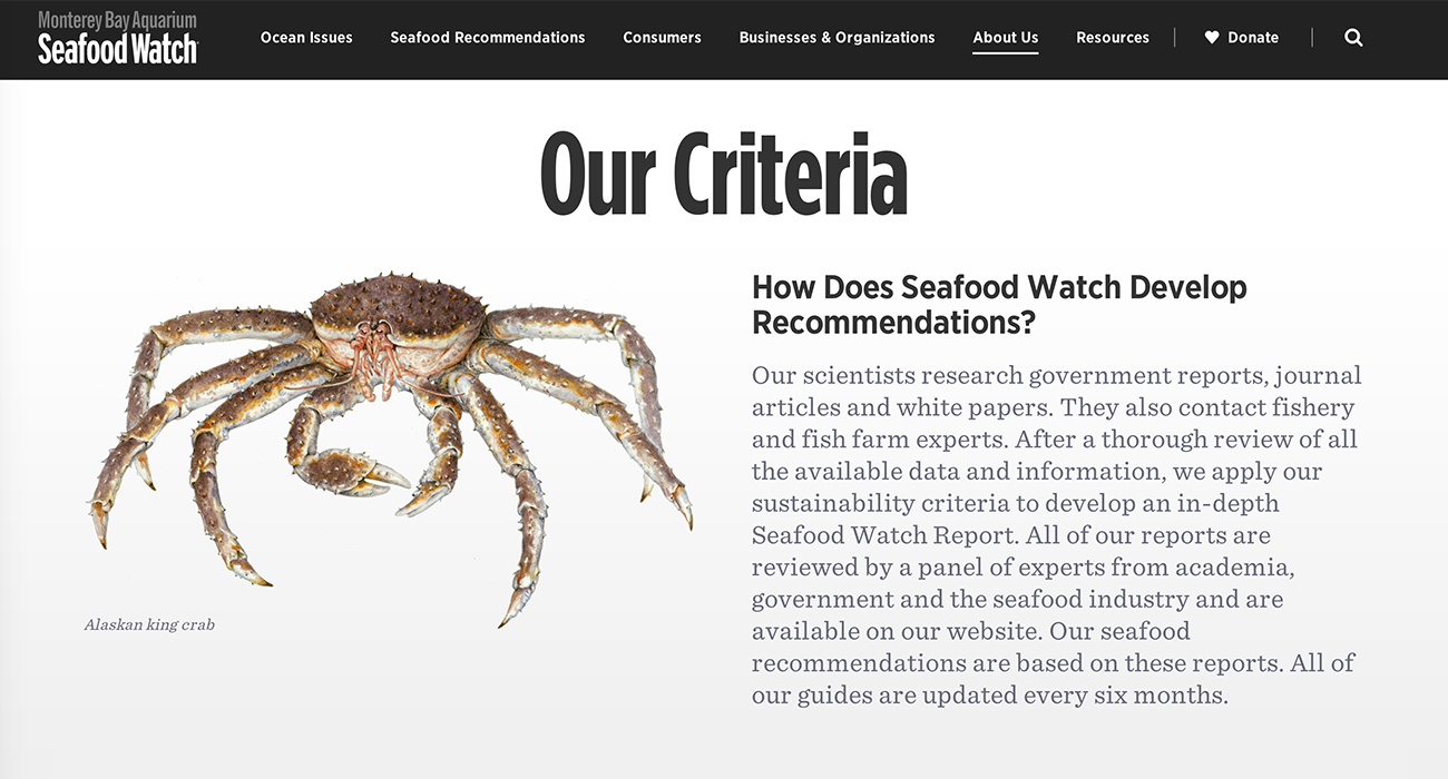
This mobile responsive site is simple, clean and minimal. Typography is cohesive and readable throughout.
There is a clear Donate button, with a heart icon in the global navigation–accessible from anywhere on the site. The nonprofit website design also has action items throughout the interface, without pressuring users to donate.
This is an important factor in their web presence since they are asking users to make a lifestyle change.
Rather than selling a way to support the sustainable seafood industry, the organization helps users “make better choices”. The site gives everybody resources which include partners, recipes, and recommendations.
The language used on this site makes people feel like they have alternative and better options– rather than believing that options are limited!
Room for improvement on this nonprofit web design:
- Add an SSL certificate for added security and positive signals to Google that the site is a trusted source.
- Reduce page load time–the faster the page loads in a browser, the more likely users are to stick around.
Hope For Haiti
Brand mission: To improve the quality of life for the Haitian people, particularly children.
Hope For Haiti is a Haiti non-profit organization focused on improving the quality of life for the Haitian people.
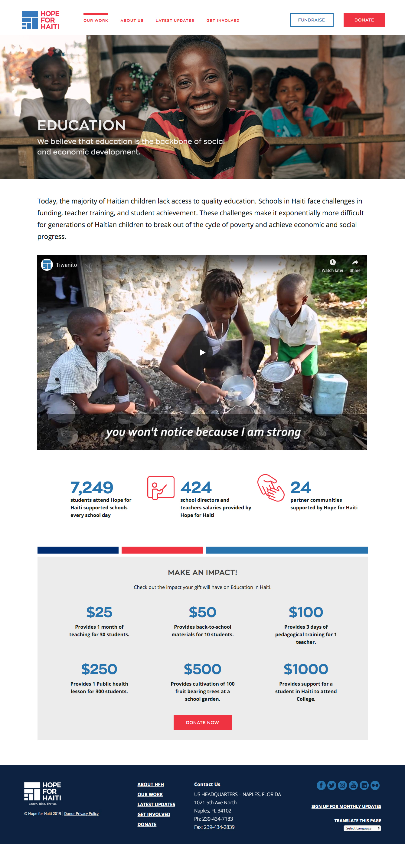
In celebration of the nonprofit’s 30th anniversary, a new brand identity was created and launched. The blue and red colors in the new logo mirror the Haitian flag while paying tribute to the colors used in Hope for Haiti’s original logo.
A new brand identity is an opportunity for designing a nonprofit website from scratch. And this new Hope For Haiti website showcases all the best practices including engaging visuals, effective white space, a prominent Donate button, and more.
Take notes from the screenshot above, and include these elements to create the best web design for nonprofits:
- High-quality, emotional photography
- A video that tells a story
- Infographics that back up the cause
- Clear call-to-action for donation
- Consistent color scheme
Room for improvement on this nonprofit web design:
- While the blog does get articles published, the schedule is inconsistent and can benefit from regular publishing.
- Blog articles could use social share buttons to help increase exposure.
Oxfam America
Brand mission: To tackle the root causes of poverty and create lasting solutions.
Oxfam is an extremely well-known organization that works to aid those afflicted by poverty, hunger, and injustice.
There is a large emphasis on donations when visiting their site. But, rather than minimizing those who may not be able to donate money, they also give users the opportunity to find ways to volunteer by taking action in their communities.
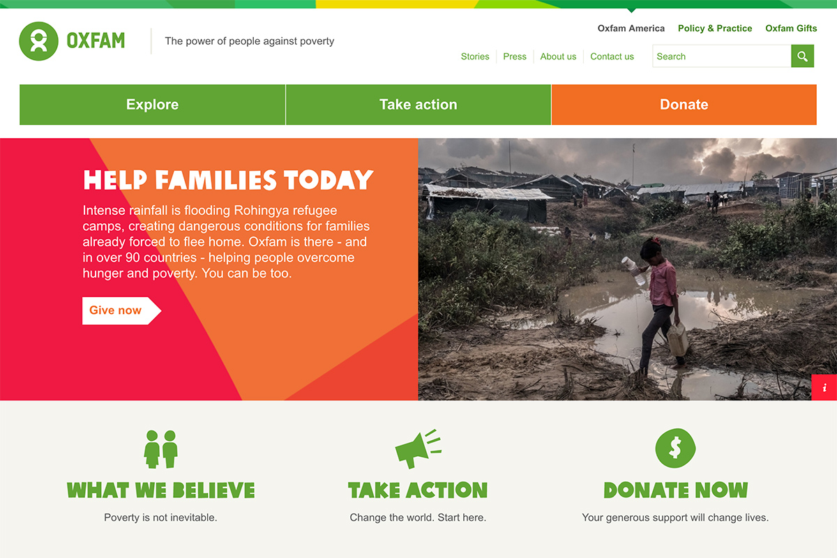
This nonprofit website design uses bright contrasting colors against a white background. The color palette makes being a part of their cause comes across as fun and energetic.
Photography used throughout their site elicits human emotion by depicting communities supported by the Oxfam organization.
Oxfam encourages people to be proactive and gives them a lot of options to “take action”. The primary navigation is extremely simple, providing just three options that lead to pages with secondary navigation.
From a brand strategy standpoint, Oxfam provides a positive view of advocacy that is focused on community involvement.
Room for improvement on this nonprofit web design:
- Oversimplified navigation provides a quick happy path for donors (with the prominent orange Donate button), but other areas of the site can start to lead down a sub-navigation rabbit hole. Although the breadcrumb navigation helps a user with orientation, the site could use a more prominent mega-menu of sub-navigation.
- Text in various areas of the website may read too small on certain devices and could be increased in size for better readability.
Memphis Zoo
Brand mission: To preserve wildlife through conservation, education and research.
The Memphis Zoo is not only just an educational experience for the community and visitors to the area. Their organization is also passionate about animal protection/rights, animal research, and improving the zoo environment for animals.
Here’s the deal:
The sheer simplicity of the user experience when first landing on the Home page is what puts the Memphis Zoo on our list of the best nonprofit website design.
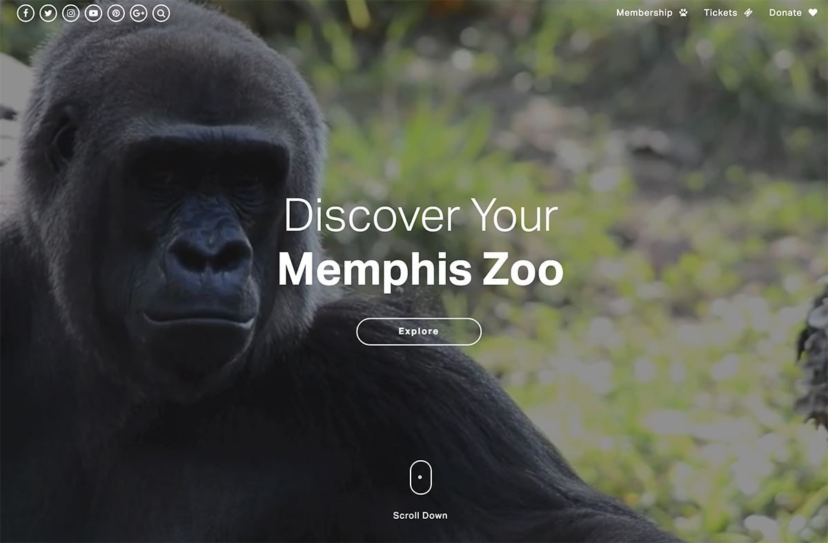
Vivid video footage of exhibits, animals, and the zoo environment plays in the full-screen background of the main home page area.
In the header navigation, three clear links prompt users to funnel into deliberate paths to conversion:
- Membership
- Tickets
- Donate
As the user scrolls down, more engaging content appears along with a secondary navigation bar.
The imagery throughout this nonprofit website design is rich and high-quality.
Room for improvement on this nonprofit web design:
- While the blog does get articles published, the schedule is inconsistent and can benefit from a regular cadence of publishing.
- Blog articles could use social share buttons to help increase exposure.
Slavery Footprint
Brand mission: To build awareness of and create action against forced labor, human trafficking, and modern-day slavery.
Slavery Footprint is an interactive website that prompts visitors to find out how their lifestyle supports slavery. This is an extremely difficult topic to discuss and even harder to encourage users to act on.
This organization knows how to tell a good story with their online presence.
According to their factual data, many of the goods we consume for reasonable prices come at the expense of cheap or free labor with questionable working conditions. Slavery Footprint takes a different approach to explain this by using eye-catching animations and friendly illustrations. High-quality infographics show how we live our lives against the stark existence of slaves around the world.
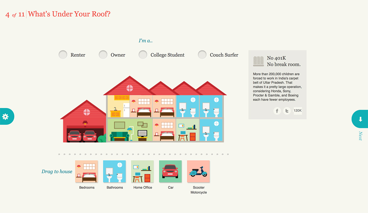
The user experience here is not typical for a nonprofit website design.
First, users take a survey to find the way their own life compares to people who work in factories making our clothing, cars, and various other everyday items.
Also, the survey shows how the items you buy contribute to the unhealthy slave ecosystem. The web design style uses a color palette full of bright yet sophisticated colors with fun and unconventional illustrations to keep users engaged. Illustrations provide a tangible comparison, showing the bounty of how we live our lives against the stark existence of slaves around the world.
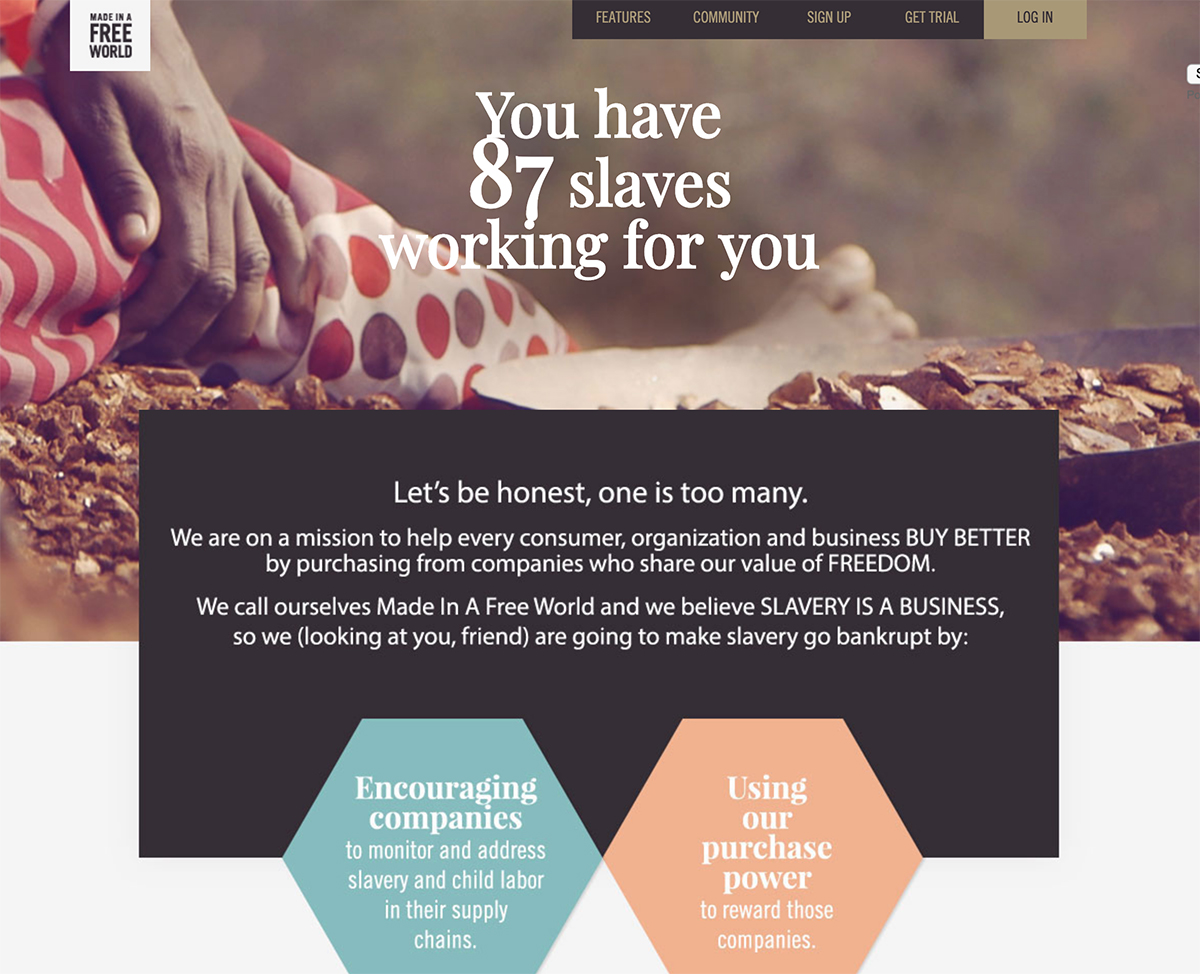
Room for improvement on this nonprofit web design:
- The website is not as useful on a mobile phone, compared to desktop. The layout is not always responsive and sometimes stalls on page load.
- The Donate button gives a 404 error message…uh-oh!
Best non profit websites: 2021 and beyond
An effective nonprofit website is always one of the biggest tools in your marketing arsenal for generating brand awareness and building a community for giving.
In order to create a nonprofit website design that meets the needs of your target audience, first understand who exactly that user persona is.
Then, consider including the following must-haves as your nonprofit website best practices:
- Engaging images, graphics, and video
- Effective use of white space
- A prominent, global Donate button
- Responsive design for desktop and mobile devices
- Strategic search engine optimization
- Consistent blog content publishing
[click_to_tweet tweet=”An effective nonprofit website should act as a tool to create excitement around a cause and to generate continued support. #nonprofit #webdesign” quote=”An effective nonprofit website should act as a tool to create excitement around a cause and to generate continued support.”]
Looking for the best nonprofit website design inspiration? Check out our picks for 2021:
What nonprofit website design inspiration can you share with us?
Share with us in the comments below!
Need help with your business or nonprofit website design? FreshSparks is a branding agency specializing in brand strategy and identity, website design, and digital marketing. We can help you create a brand people love. Contact us to learn more.
If you liked this post, please share!

Great list you have here and these are definitely very good websites for non-profit organizations. A non-profit’s website shouldn’t only be focused on acquiring donations and sponsors, but should also be capable in educating its visitors about the cause. This is a great platform for reaching potential supporters, so critical to its success is the website’s friendly approach, informative sections, and testimonials of volunteers. Here are another five non-profit websites with a very good design as well 😉 https://goo.gl/S6tvaB