So you made a mistake. Or, did the website you were using make a mistake?
Either way, errors are a big point of frustration for web users–we don’t like them and they can cause us to bounce away from our intended path.
Creating the best website error message is often overlooked, but it’s important for an optimal user experience.
Chances are you have encountered a poorly executed, standard error message UI for web application use.
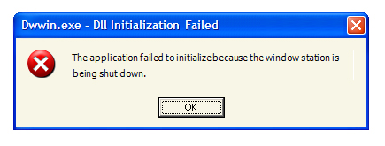
What does this mean?!
User-friendly error messages need to clearly define what, why and how:
- What the problem was.
- Why it happened.
- How to solve for it.
So how can you design and develop a better user experience for your visitors, and in turn increase conversions?
In this article, I’ll show you what to focus on for the best error messages.
Five Ways to Create the Best Error Messages
1. Be specific to the user’s task.
When writing the error messages, it’s important that your copy is customized to the actual error that occurred.
It can be confusing when a website error message design doesn’t offer any clarity as to what exactly went wrong. This is especially critical if users are inputting personal data or completing a checkout process (it can cost you a lead, or worse–a sale).
A more positive error message experience is to be told the specific problem and given a way to correct the issue.
Concise guidance is necessary for the best error messages, to keep users engaged and willing to make the corrections.
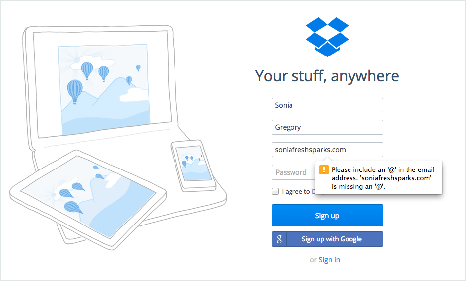
Notice how Dropbox is very detailed in their error message alert for an incorrect email address, by requesting the missing character.
2. Let users know you’re human.
Oftentimes, a generic error message can sound very technical to a consumer (read: intimidating). Moreover, some errors place blame on the user.
It’s more effective to be:
- understanding,
- friendly, and
- speak the same language.
A good way to incorporate a more human tone for more user-friendly error messages is to think about explaining it out loud to someone.
Try this:
How does the error message sound when you speak it in conversation?
If someone is less comfortable with technology, an error can be a huge roadblock. Reassure the user that they are not ‘talking to a computer’.
Optimizing error message UX (user experience) is also a good opportunity to incorporate icons. It’s just another way to humanize your message since people respond well to imagery.
3. Embrace humor in the situation.
Although a user may not want funny error messages when their credit card number isn’t correct, there are some situations where it might be nice to be humorous.
Now, I am not talking about funny as in face-palm-worthy (remember those Windows “task failed successfully” error messages?).
A funny error message should still be informational, clear, and polite.
Keep your tone lighthearted! Otherwise, it may seem like you’re trying to cover up a mistake rather than owning up to it.
Something went wrong, so tasteful humor is a bonus when it happens.
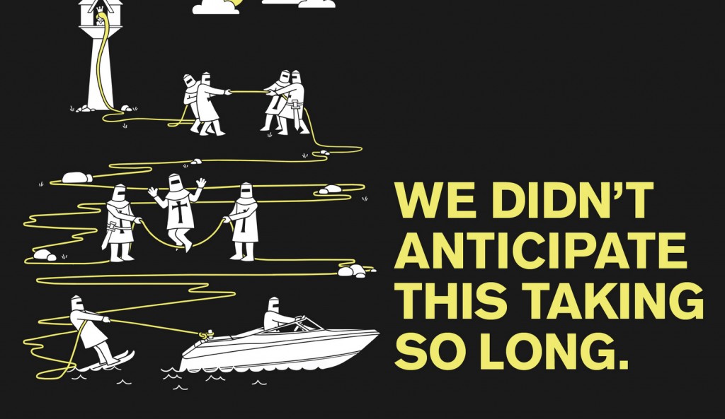
Piccsy uses unique and humorous illustration, coupled with a humble message when it presents a funny website error message design.
4. Don’t make users work for it.
Doing some heavy lifting for your user is usually the best way to ensure a great experience. You can have all the best error messages in the world, but if the user has to stop and think for a while to correct an error…it defeats the purpose.
Help your audience get through a task efficiently and effectively. If it’s difficult, the only thing a user will remember is how long it took to figure out what was incorrect.
Your user probably won’t want to live through that again.
A good example of this is during a login process. It’s possible that one wrong combination for a username and password could lead to multiple attempts before success is achieved…or frustration enough to quit.
Login error messages are the worst, am I right?
When the average user has 10 passwords and 4 usernames at any given time, the effort can seem insurmountable (that’s 39 chances to get it wrong!).
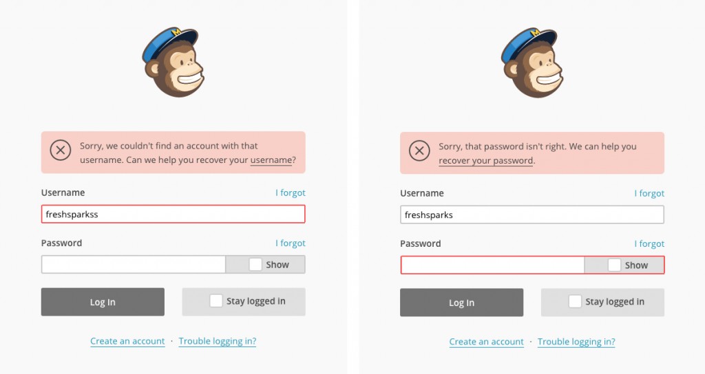
The stress of forgetting a username/password combo is alleviated on the MailChimp website. If a username does not exist, they tell you before you even attempt a password.
Clear and visible password error messages reduce the amount of work a user has to do, in order to determine the right combination.
Start with your login error first, when improving the overall user experience of your website. It’s one of the most important types of error messages to get right!
5. Create a useful 404 error page message.
The default, generic error message provided by a user’s browser can often be unhelpful and vague.
To create the best error messages for a 404 page, it’s important to know what type of website error this is.
A 404 error message means that a page is not found. The cause could be a:
- Deleted page
- Broken link
- Mistyped URL
A successful 404 error message design will help a user find the information they’re looking for, and encourage them to explore your site further.
Customize your 404 error message text to include the following:
- A clear notification that the page cannot be found
- Consistent header and footer from the main site (navigation especially!)
- Links that may send users down an alternative path, or to the home page
- A search bar to help users find something specific
One of the more important 404 error page best practices is to set up the page so that it returns an actual error from the webserver–you don’t want it to get indexed by search engines.
The takeaway:
Design for when things go wrong, as much as for when they go right!
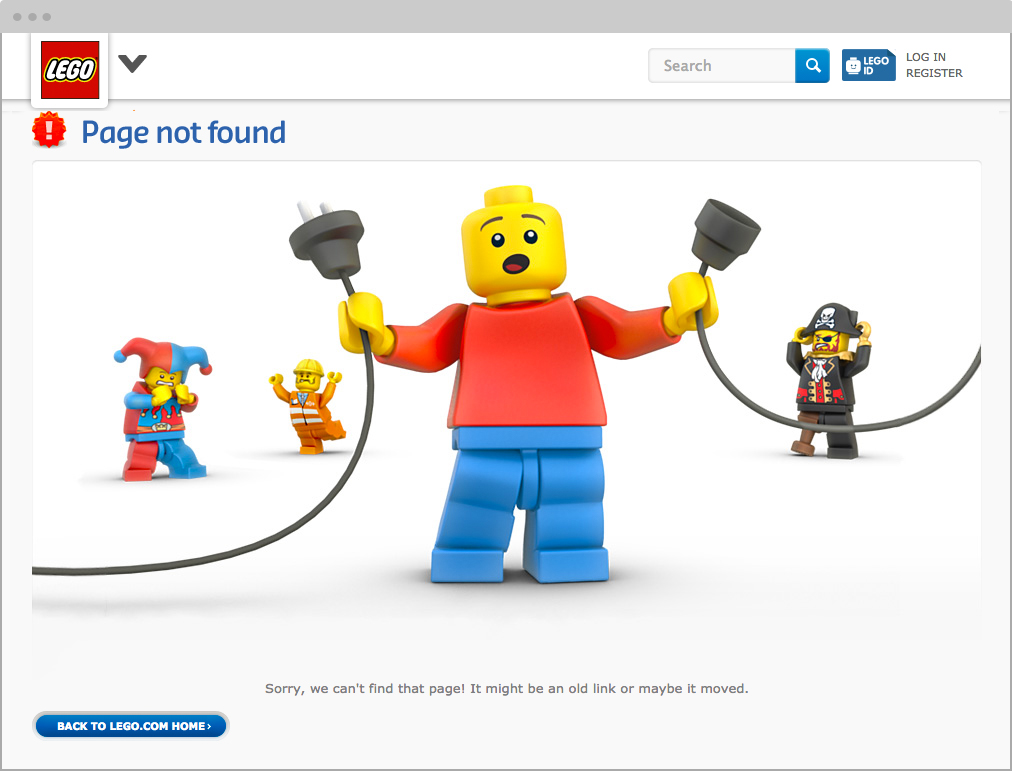
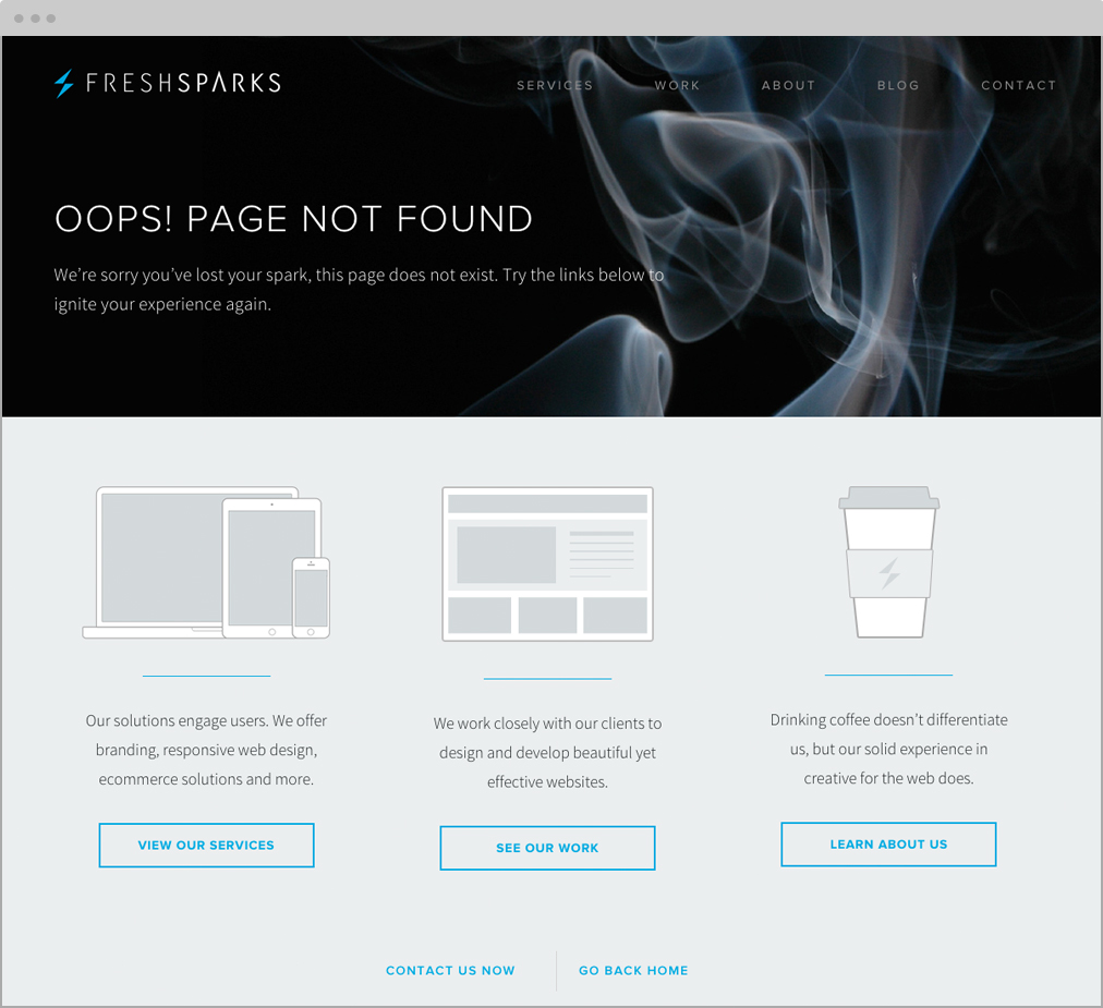
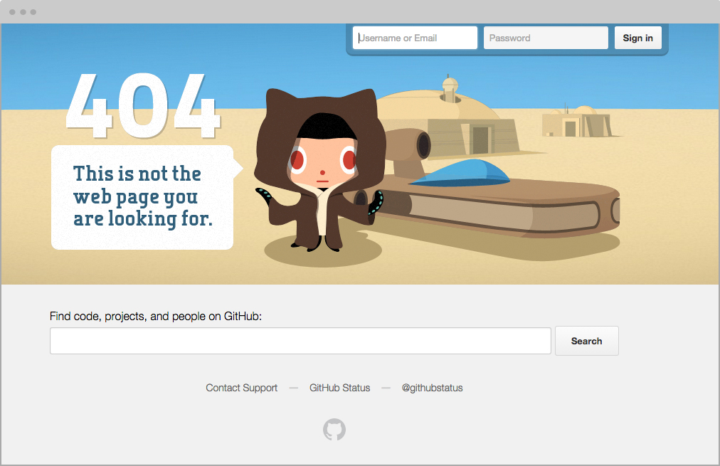
Many websites get creative with their 404 error pages–alleviating the annoyance of an error with lighthearted humor or guiding a user elsewhere.
404 Error Message Design Examples
Take a look at a few effective 404 error message examples below.
Error Messages: Best Practices for Better UX
Think about all the places on your website that things could go wrong. List them out, and then start to assign a concise and friendly error message to each.
Human tone and language will help users relate better to a situation with an error, and help them understand it.
Use these five guidelines to offer examples of good error message examples on your website or app.
- Be specific to the user’s task.
- Let users know you are human.
- Embrace humor in the situation.
- Don’t make users work for it.
- Create a useful 404 error page message.
Apply styling to your error messages that are branded to match your site, yet still stands out enough to alert the user.
If you work with a developer, collaborate to create error message guidelines for what makes sense in the front end interface, and what can be done to support it on the backend.
These small changes will improve user experience significantly, by reducing frustration and keeping the path to completion on track!
What other tips can you share about creating the best error messages for users?
Share your comments or questions below!
FreshSparks is a brand agency specializing in strategy, design and digital marketing solutions. We can help you build a successful new online presence, or upgrade an existing website. Get a free consultation for your next project.

Very Nice Blog..!! Thank you for sharing this information with us. It is very useful and important information for those who are doing this blog commenting at the first time.
I really appreciate this post thank you for sharing these type of posts. I am saluting you for the writing and for bringing this up and opening the discussion about web push notification campaign ideas. I really appreciate your ideas.
I read a Webeyez (www.webeyez.com) report that said 37% of site visitors receive an error message during the login process… A user centric error message is important
Nice tips for user experience error messages. Keep sharing. Thank You!!
(Bullet #4: Don’t make users work for it): The MailChimp website login form has a security issue. It lets me figure out whether a username exists without having to know the password. I can type in any sequence of characters and, if I don’t get a message that the username does not exist, I know that it is a valid username. This way, I can get a list of usernames that I know are existing users on MailChimp. Now, my only problem is to figure out the password. There is a balance needed between giving helpful information and giving out too much information. One lesson I learned in secure coding was that, when a login attempt fails, just say that the username-password combination was invalid. Do not say whether the username by itself was valid or not.
I just read @conradreuter:disqus’s comment, which makes exactly the same point.
+1 … Don’t do this
thank you for this information. really helpful A179
Glad you found this helpful. Thanks!
:3
Thanks, Sharon!
Your own error handling is lame. Making me click back? C’mon.
Appreciate the feedback, Dougy! Where exactly are you getting an error? Would love to address the problem.